• about
  • contact
  • blog
jordan fretz design | freelance graphic design & art direction | branding & logo design
  • about
  • contact
  • blog

VOTE CLEAN TEETH

With all the elections going on here, it seems every intersection is filled with signs. Lately, I've really been trying to think more strategic for my freelance clients and this seemed like a perfect opportunity to stand out in a sea of the same. Each candidate has signs displayed back to back to back. Yeah your running for office, we got it after the first ten signs.

I sent my dentist a mockup around 10pm showing a sign with his name (which is also his practice name) "for dentist." He liked the idea and by lunch the next day, I was uploading the final layout for printing signs. Twenty-five signs were placed along Haywood and Woodruff Road, leading right to his office location with another sign out front. 

Ben's office received phone calls, they heard some buzz at the pole lines and attributed seven or so new patients to the advertising. I always want to be creating work that both stands out and gets attention, but it's really satisfying to hear when that work also produces results. 

vote-guerilla-marketing-Ben-Daniel-for-dentist-no mockup.jpg
vote-guerilla-marketing-Ben-Daniel-for-dentist-2.jpg
vote-guerilla-marketing-Ben-Daniel-for-dentist-1.jpg
vote-guerilla-marketing-Ben-Daniel-for-dentist-3.jpg
tags: vote, dentist advertising, voting signs, vote for clean teeth, guerilla advertising, guerilla marketing, outdoor design, guerilla design, dentistry advertising, dentist marketing
Tuesday 06.26.18
Posted by Jordan Fretz
 

EVERYTHING MEDICAL SCHOOL FORGOT

doctor-gift-anatomical-chart-design-by-jordan-fretz.jpg

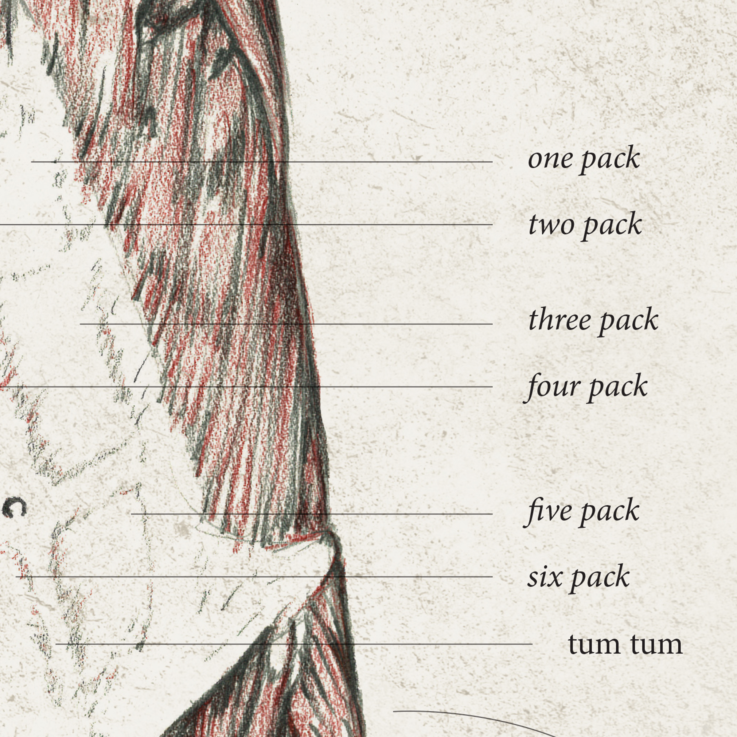
In my first year of college, I had to take two mandatory drawing classes. Awesome, graphic designers aren't always the best 2d artists and since I grew up drawing and painting, I figured it would be an easy good grade to help balance out English 101 :). Turns out the drawing classes took quite a bit of time and we had to also do some technical anatomical drawings completely to scale. I think I put around ten or so hours into each one to get all the proportions decent and include all the intricate muscle groups. While at times I remember running straight from soccer or basketball practice to get over to the art building still sweaty and with limited time to get some drawing in, they were fun to work on and slowed my mind down.

Recently I had the idea to scan in the drawings and create some funny callouts. Going to a buddies residency graduation seemed like a good cause to assemble the first poster and present it as a gift. I plan to create a few other versions with more callouts so they could be hung as different posters together in a series. Possibly license them to med-schools for selling in their campus stores and just send to doctor offices to get a few smiles. All in all, fun to look back at some old drawings, and to combine a creative thought with some artwork. 

anatomy-drawing-2.jpg
anatomy-drawing-4.jpg
anatomy-drawing-3.jpg
anatomy-drawing-5.jpg
tags: anatomy drawings, anatomical chart, anatomy callouts, doctor office art, custom doctor office art, art for doctor offices, medical field art, medical art, med school gift, med school gradutation gift, med school graduate gift, residency graduation gift
Tuesday 06.26.18
Posted by Jordan Fretz
 

THE PERFECT BALL OF ICE

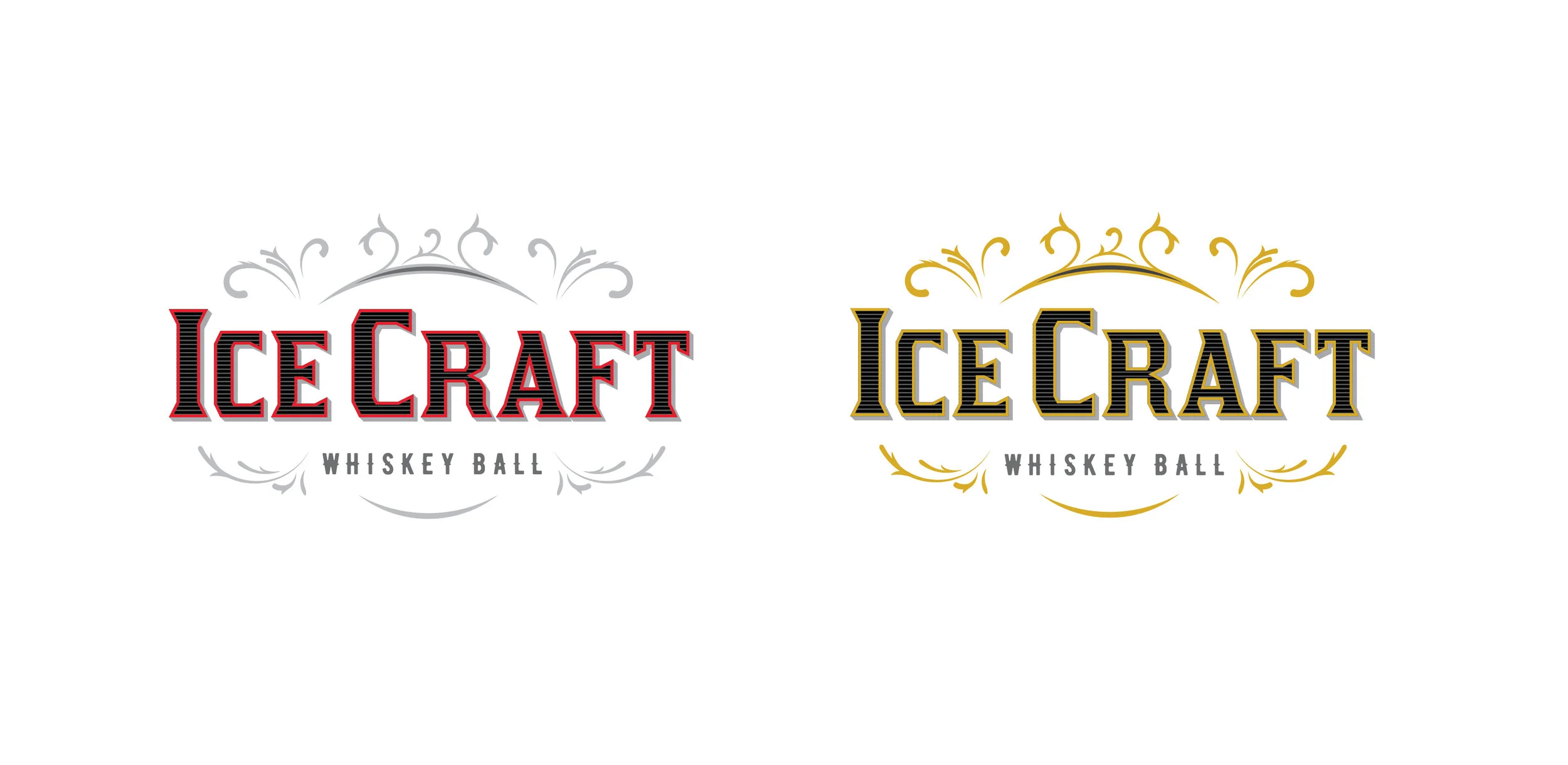
I never knew how a Whiskey Ball was actually made until I saw IceCraft’s product. They manufacture a product that takes a block of ice, could be from water frozen in a solo cup or anything large enough, and compresses it as the ice melts into a perfect ball. It takes a matter of seconds for the weight of the top to drift down forming the ball. Pretty cool! Anyway, before they sell and promote the them for people to keep on their wet bar shelves, they needed a logo design and that’s what I do. They wanted an older ornate look and it was a lot of fun to create a few flourishes and do some custom type. Below are the layouts and finally the chosen version.

whiskey-ball-logo-design-by-jordan-fretz-desgin-14.jpg
whiskey-ball-logo-design-by-jordan-fretz-desgin-15.jpg
whiskey-ball-logo-design-by-jordan-fretz-desgin-19.jpg
whiskey-ball-logo-design-by-jordan-fretz-desgin-17.jpg
icecraft-logo-typography-design-by-jordan-fretz.jpg
whiskey-ball-logo-design-by-jordan-fretz-desgin-18-01.jpg
logo-brand-standards-manual-design-page-by-jordan-fretz.jpg
tags: whiskey logo, whiskey ball, custom type logo design, customized typography, whiskey logo design, whiskey brand logo, whiskey brand logo design, ice logo design, ice shapes, whiskey ice, whiskey ice logo
Monday 06.25.18
Posted by Jordan Fretz
 

MANUFACTURING AND BBQ TOGETHER AT LAST

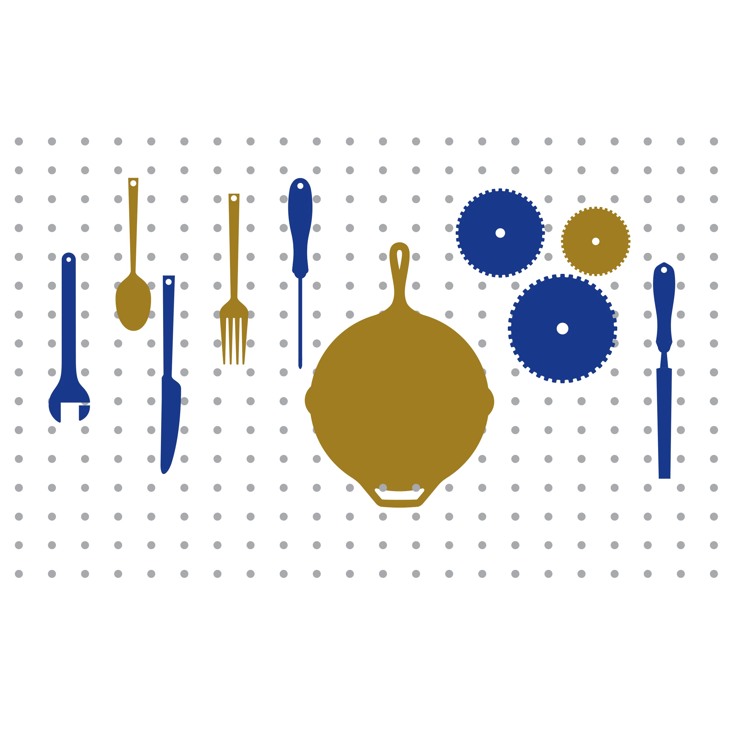
Basically combine manufacturing and dinner each quarter for a meeting of the minds and that sums up Industry Hour. It’s a great way for Innovative Manufacturing to look like a thought leader and make some great connections. The meetings have been growing since they started this a while back and even have sponsors now for the event. Putting a brand look to the meetings was a lot of fun and you can see how my thoughts ranged from blades to gears and the balance I kept tweaking between dinnerware and tools.

industry-hour-final-design-full-color.jpg
industry-hour-final-design-full-color2.jpg
manufacturing-dinner-concept-by-jordan-fretz-design-2.jpg
manufacturing-dinner-concept-by-jordan-fretz-design.jpg

In the end, the caliper was the tool common to many of the businesses that would be present and just made sense for the meeting. It’s not often I get logos where I’m given two distinct things to combine (like everyone on dribble makes up, Monkey Music or something) and that made this one a lot of fun.

industry-hour-final-design-full-color-1.jpg
Industry Hour Flyer Final.jpg
tags: manufacturing logo design, event logo design, manufacturing event logo design, meeting logo design, manufacturing meeting
Sunday 06.24.18
Posted by Jordan Fretz
 

WHAT'S A VISUAL CASE STUDY?

Case studies are pretty common to portfolios. They tell the original problem (sometimes talking over the brief), what happened over the course of the project and how the solution was arrived at. They show some work and maybe even talk over what goals were met or exceeded with some statistics (number of impressions, number of leads etc.).

My soccer and sports logos have been a good side hustle for me. I have teams, clubs and organizations contacting me for work after seeing some designs on google images, pinterest, dribble or hopefully after visiting customsportslogo.com or customsoccercrest.com. The easiest way to sell work for new projects is client seeing previous projects and admiring the thought, styles and professionalism. For some reason when I seek out work, it's more difficult to gain that level of trust and be given the time with the same level of engagement.

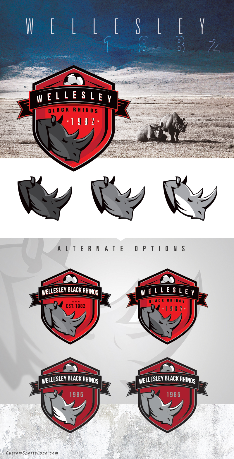
With this in mind I wanted to create some visuals that would put some of my designs in an environment that relates to the design itself. I thought showing some of the iterations or variations on design would give insight to the time spent on each project and the level of detail I work with. I didn't want to include all the copy points and info surrounding the project, as I feel most people glance over that anyway, but instead show compelling visuals and keep them simple. Here are the first few I have done and I am excited to do quite a few and tell the stories visually online.

custom-soccer-logo-design-options-for-fc-colorado.jpg
custom-soccer-logo-design-options-for-honolulu-galaxy.jpg
Multiple-Option-Examples-1-10-Futbol-Alliance-final.jpg
custom-soccer-logo-design-options-for-wellesley-black-rhinos.jpg
tags: custom soccer branding, soccer club design, custom soccer crest, custom soccer logo, custom sports logo, sports logo design, custom sports logo design
Thursday 05.17.18
Posted by Jordan Fretz
 

TRIUNE CHARITY AUCTION

charity-art-auction-jordan-fretz-artwork.jpg

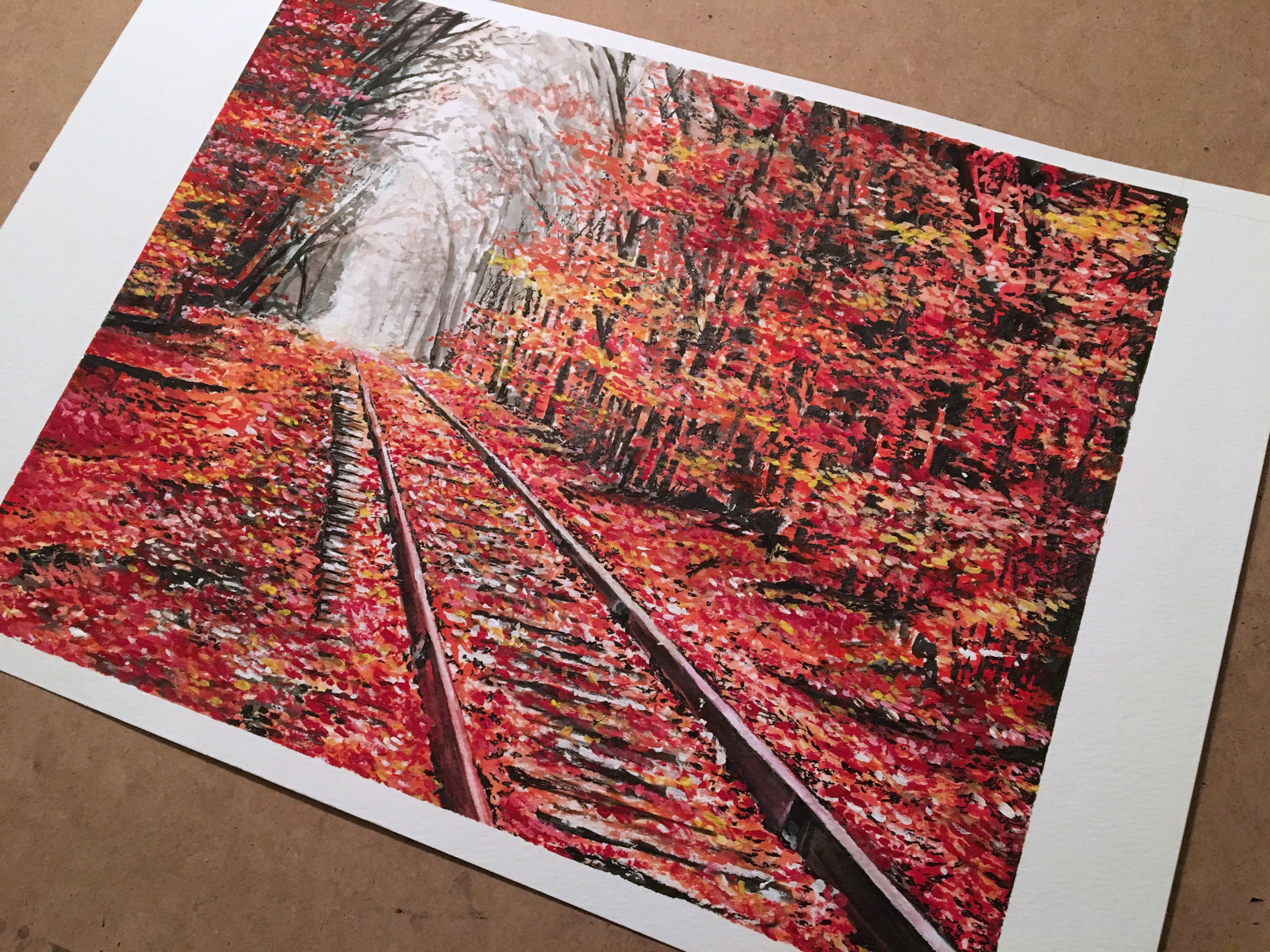
I had a great time at the Triune Art Auction at Noma Square in Greenville. All sales went to the Triune Mercy Center and the work they are doing for the homeless. The event had a silent auction as well as a live auction with over 50 pieces of artwork. Its was exciting to see the charcoal panda among the top few sellers. Not bad for a salvaged piece of cardboard :).

cardboard-art-charcoal-panda-by-jordan-fretz-3.jpg
cardboard-art-charcoal-panda-sketch-by-jordan-fretz-3.jpg
fall-gouache-painting-by-jordan-fretz-2.jpg
tags: art auction, charity art auction, cardboard art, charcoal drawing, art sale, bid card, jordan fretz art
Wednesday 04.25.18
Posted by Jordan Fretz
 

DIVERSE BY DESIGN

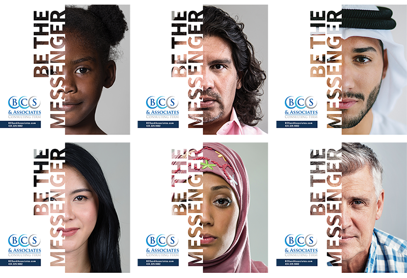
Some recent handout materials for a consulting group specializing in social justice and equity. Much of their philosophy is centered around reflection and self awareness. The goal was to create an interesting leave behind and various other collateral pieces that would continue to reinforce their key themes and push viewers to give some feedback/take a deeper dive online.

For the handout specifically, a few shown below, we were able to print various fronts consisting of different age ranges, ethnicities and appearances. This fit well with the overall message and really added some interest in seeing what individuals took which handout and how many were left of each race/age. Just a cool talking point someday maybe if there are 50 copies of one group and only 2 left of another. Anyway, it was a fun project in concepting and designing the handouts and also creating some posters that reinforced a similar message and style. 

Handout Mockup 3.png
Handout Mockup 2.png
tags: diversity collateral, diversity design, diversity graphic design, cultural design, leave behind design
Saturday 04.07.18
Posted by Jordan Fretz
 
Newer / Older

copyright jordan fretz design