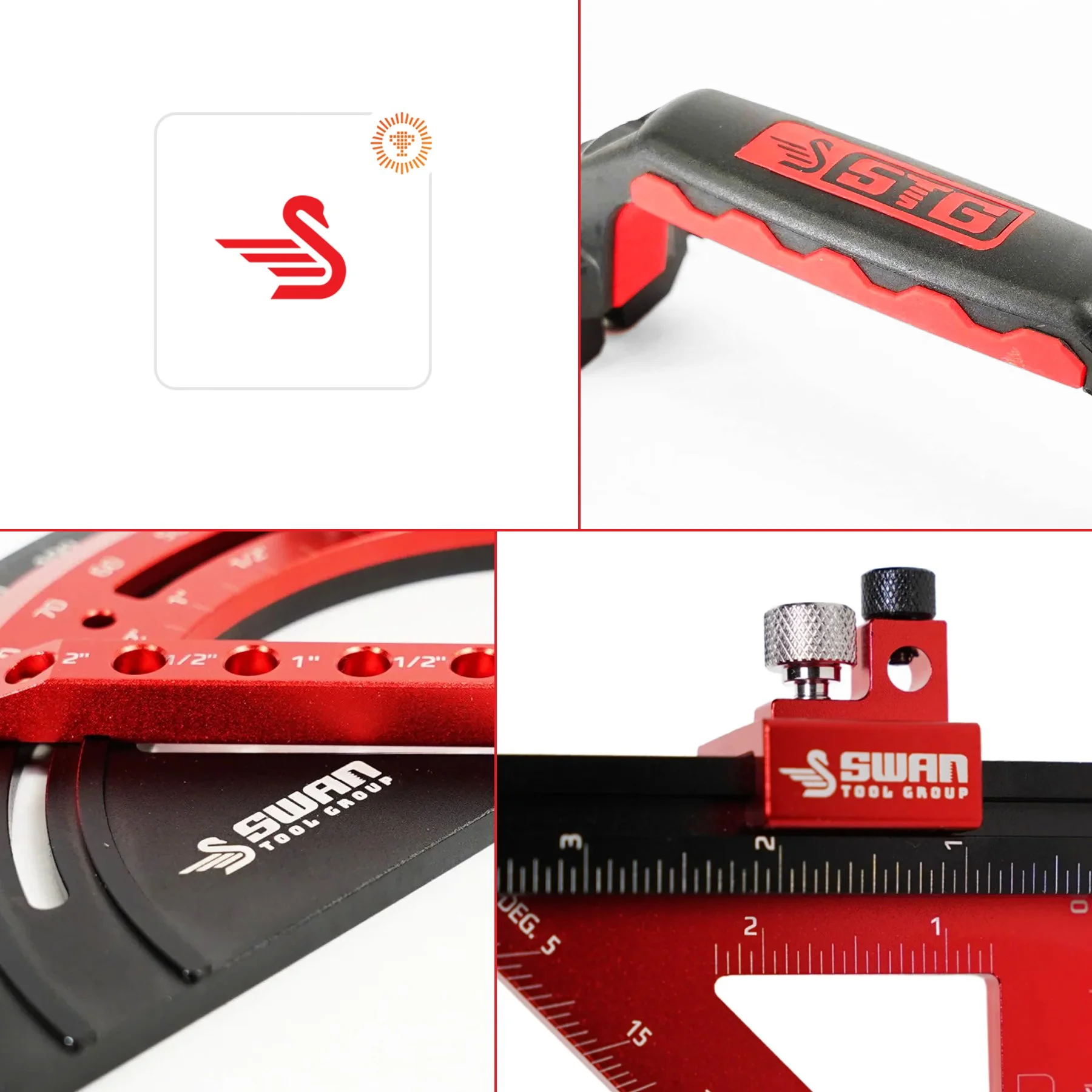
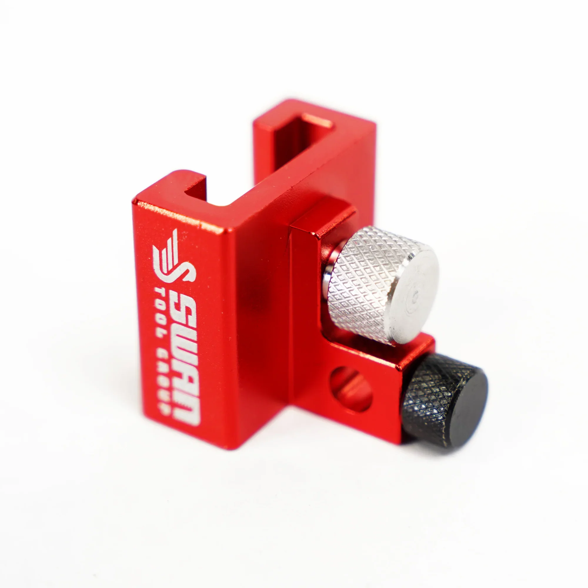
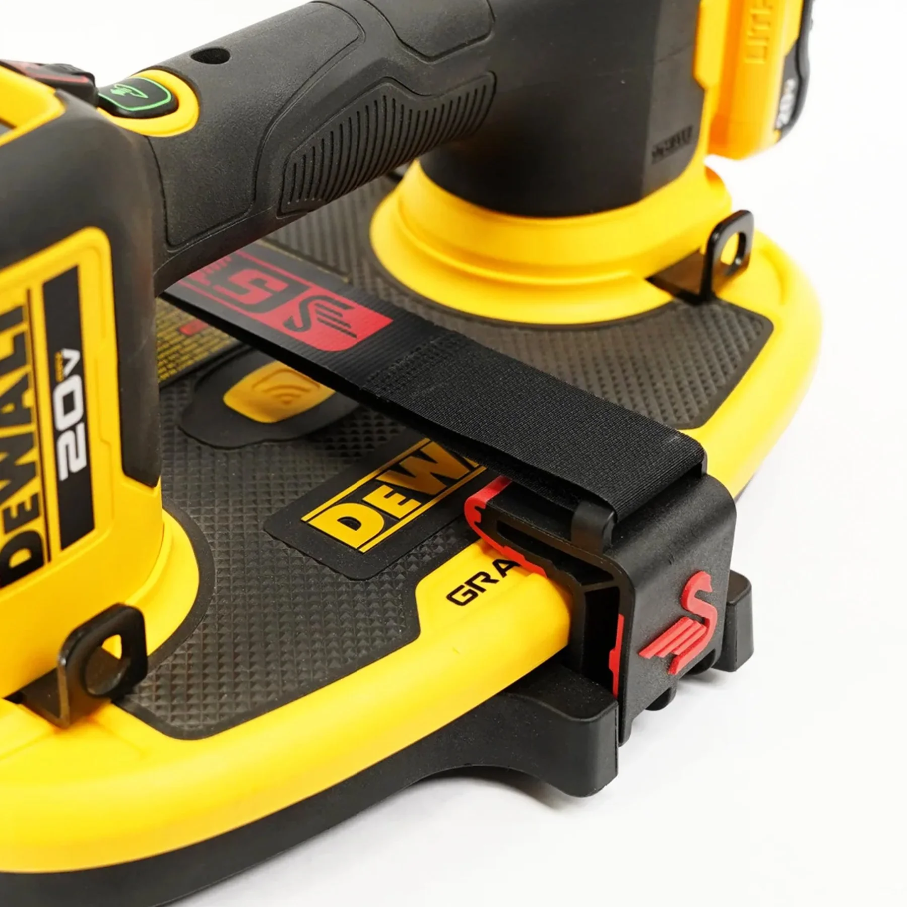
Keeping a mark as simple as possible is the goal of just about every logo/identity project I’ve ever done. Working with great clients and having a clear goal of the project for this one really helped set this rebrand up for success. See a glimpse at some of the rebrand below and go SEE THE FULL PROJECT. Excited to assist in fully rolling this out in the future. It’s been featured a few places now including, Communication Arts Magazine and appears in the 2023 Design Annual. Pretty cool.
NEW OUTLOOK ON LOGISTICS
Laying the foundation of style, tonality and visual concepts/ direction for this logistics software. A refresh with a modern/ clean look and feel and the underdog mentality of the small innovative startup competing against the more stale/ older Goliaths of the space was a lot of fun for direction. More to come.
LOGOS & VECTOR ILLUSTRATION SERIES
Put me in coach! The fine people of Red Rover asked if I could knock out 20 additional illustrations to fit with their current branding and also toss in a few one-off logos ASAP. All illustrations were done in vector form so there is flexibility for the future in resizing/ adaptation. A lot of fun to work on and the subject matter of education combined with software was a fun pairing to navigate in visual needs. Looking forward to more here!
THE "M" IS A BEATIFUL LETTER
From logo design to branding, templates to the HubSpot site design, this project was a lot of fun to work on. Since some of the alternate options in initial direction on the logo were well received, we took elements from those concepts to pull together a consistent but interesting brand package. The site was complete with mega-menus and hand drawn elements that really give a custom feel. This site is still in development and I’m excited to show off on completion!
INKTOBER 2023
A little break from the ole’ computer screen. I look forward to daily doodles on cardboard and revealing a bit of corrugation each day in October, my wife typically isn’t as excited :). I did have the kids create some of their own art with me this year. Plenty of corrugated material this year as Rand Whitney supplied 4ft sheets of cardboard for use. A little less dumpster diving this time around. See more from the 2023 Inktober series on salvaged cardboard here.
See more from the 2023 Inktober series on salvaged cardboard here.
PRONOUNCED HE-LOW
Taking part in strategy sessions, ideation on names, logo and identity development, brand guides, etc. and this software brand was a lot of fun to work on.
APP LAUNCH DESIGN & ANIMATIONS FOR THE SALESFORCE USING SALESFORCE
Illustrations, animations, app store screens, webpages and a little love all done for this software product launch. Of course there were Powerpoint decks, one-sheeters, pricing packages, etc. all done for the sales team to use as well. Really fun to create the .gifs and we kept the file size on these babies so small that the page is fast as a greased up pig? Or maybe lightning or my son to danger, whatever this is stupid and you get it. Ok, to clarify the pages load fast despite all the movement and lazy loading all the content made for a nice scroll/ user experience.