• about
  • contact
  • blog
jordan fretz design | freelance graphic design & art direction | branding & logo design
  • about
  • contact
  • blog

JUST A BRAND REFRESH

I’m thankful for clients who know it’s not as simple as tweaking a few letters and calling it a day. Trailheads has been a client of mine for a few years now. They are great to work with and even greater people on top of that. They first reached out to me after seeing one of my badge designs and hoping I could help them on a hang tag layout. I did the layouts, added some overall branding suggestions and somehow that turned into helping them redesign all their product branding on their Amazon store. It’s been fun to hear how the focus on imagery and design has really upped their sales through Amazon and I always appreciate them keeping me in the loop with future project discussion etc.

Earlier this year Trailheads recruited me to help with some new headers and imagery for their new website. As most people are aware, creating a new website takes a lot of time and resources. That made for the perfect time to refresh the logo, update colors and give a bit of direction. Since I was familiar with their logo from so many previous projects, I knew quite a few changes to suggest right away. These changes would make the logo simpler, a bit more streamlined after taking out a few kinks/bumps and more current without losing the brand equity they established (especially in the women’s trail running space).

logo-refresh-by-jordan-fretz-design.jpg

Here you can see a before and after of the work I did. I evened out the line weight, centered the diamond more with the “T” in the middle and adjusted some spacing. One thing I like to do also with a handwritten logo is tweak letters that are the same since the style is handwritten it only makes sense that they wouldn't be exactly the same. In this case the “A” letters were tweaked ever so slightly.

apparel-amazon-page-layout-design-by-jordan-fretz-design-16.jpg

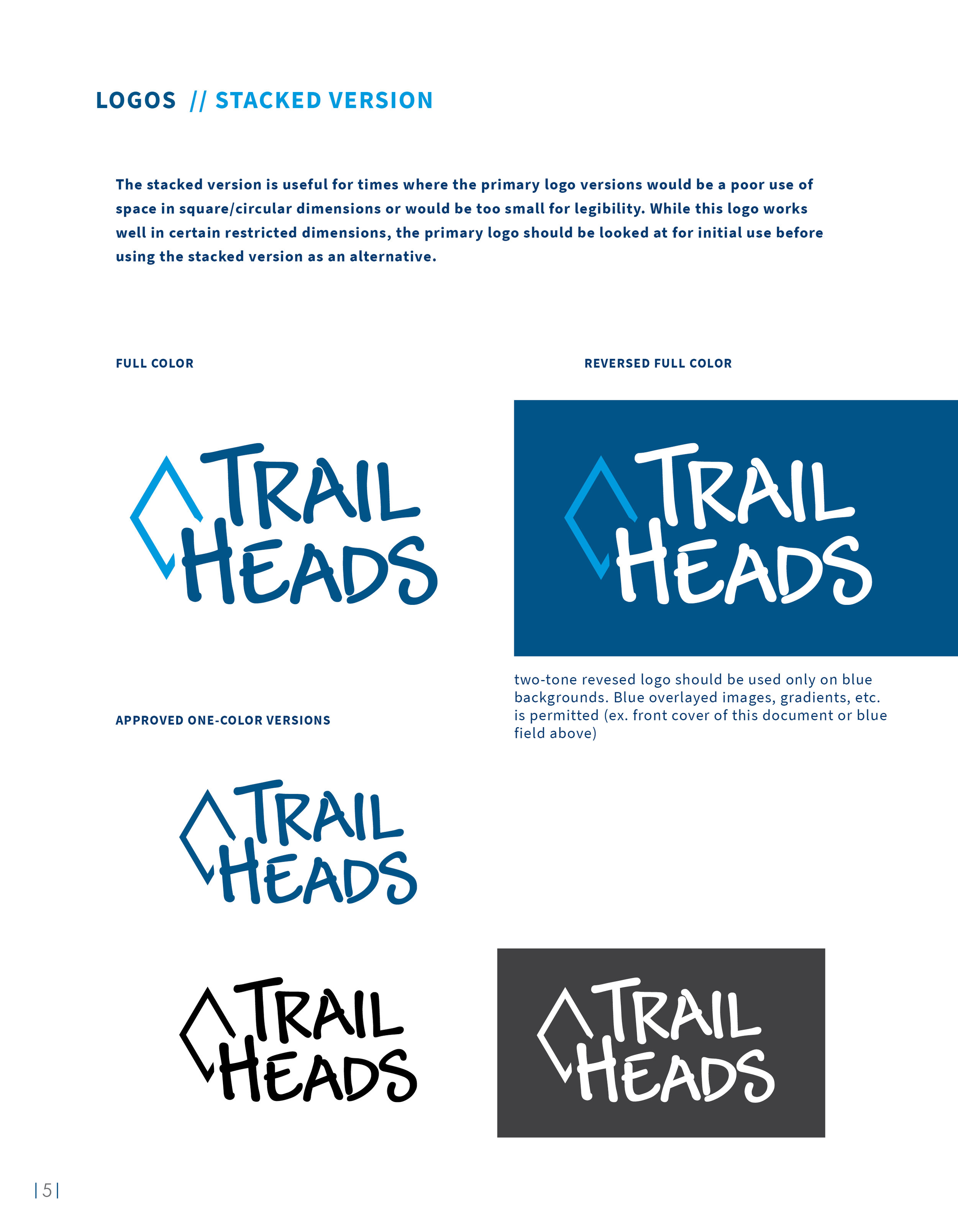
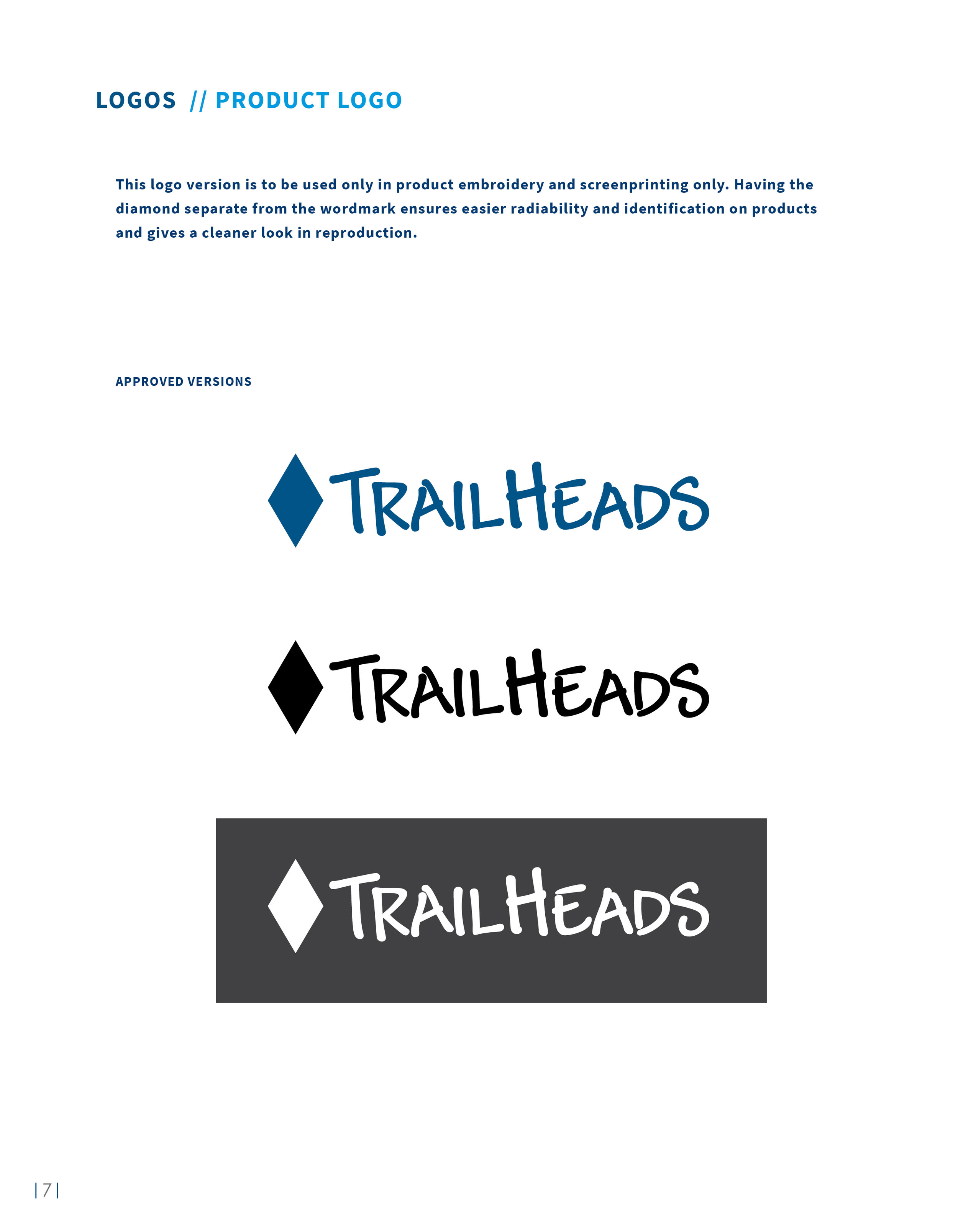
I also used a two-tone color scheme with a bright lighter blue for contrast. After looking at the logo and discussion over usage on profile images, hangtags, small ponytail holders, etc. I also created a stacked logo version. This would be very useful for square shapes and profiles the logo may need to live in. With so many printing methods and embroidery included, we also had variations on the logo created with taglines, separate diamond shapes, etc. all with a purpose to improve legibility or solve a problem on certain materials.

apparel-company-brand-identity-refresh-design-by-jordan-fretz-design-12.jpg
apparel-company-brand-identity-refresh-design-by-jordan-fretz-design-14.jpg
apparel-company-brand-identity-refresh-design-by-jordan-fretz-design-15.jpg

Key branding elements were also updated with the new color scheme and tweaked where needed to fit the new direction. These represent just a few elements used in branding and sometime I will do a post showing more vector illustration work and icons done for Trailheads.

apparel-brand-elements-by-jordan-fretz-design-01.jpg

A “TH” symbol was also created for favicon use and other very small space needs.

apparel-company-brand-identity-refresh-design-by-jordan-fretz-design-13.jpg
apparel-company-brand-identity-refresh-design-by-jordan-fretz-design-1.jpg

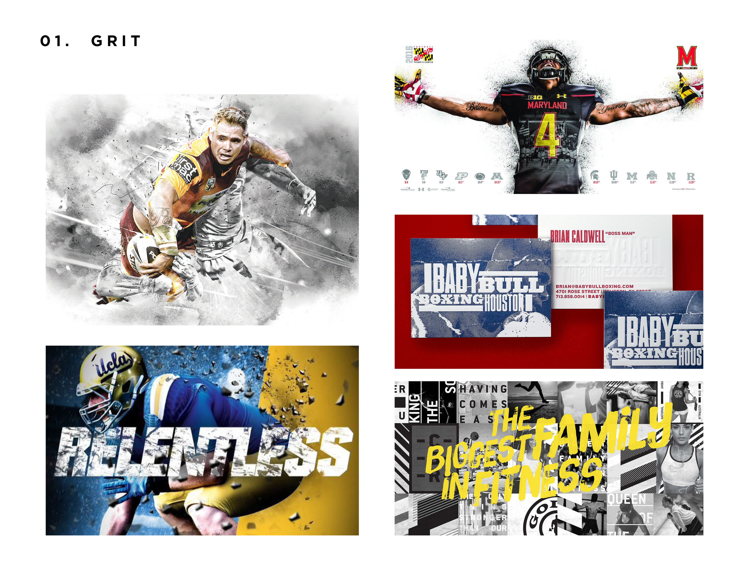
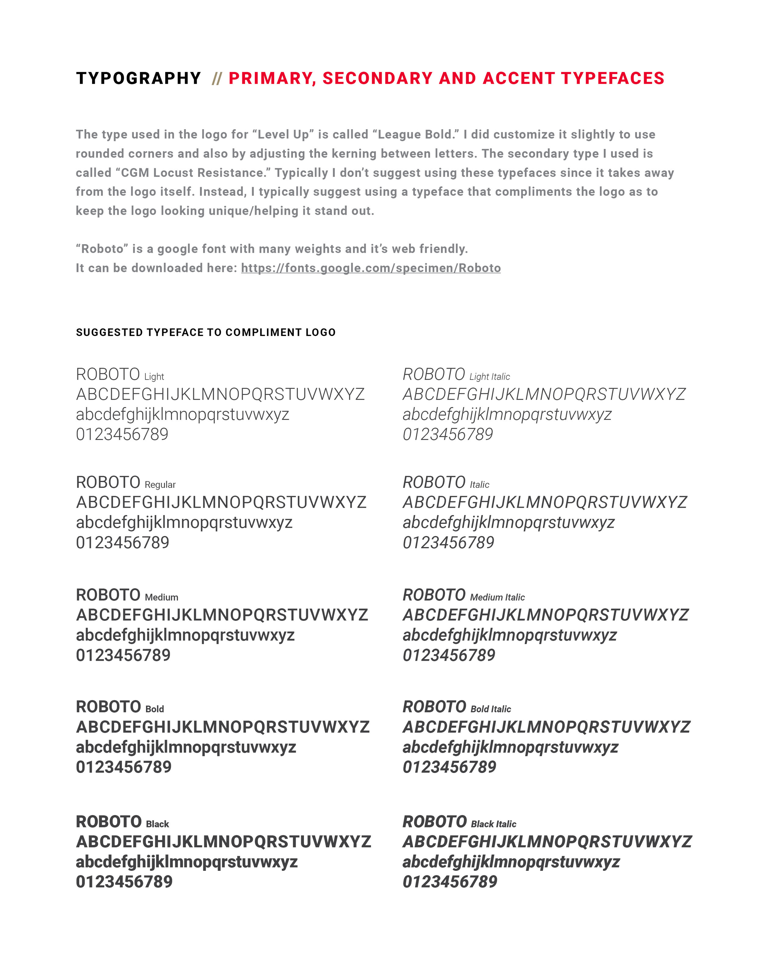
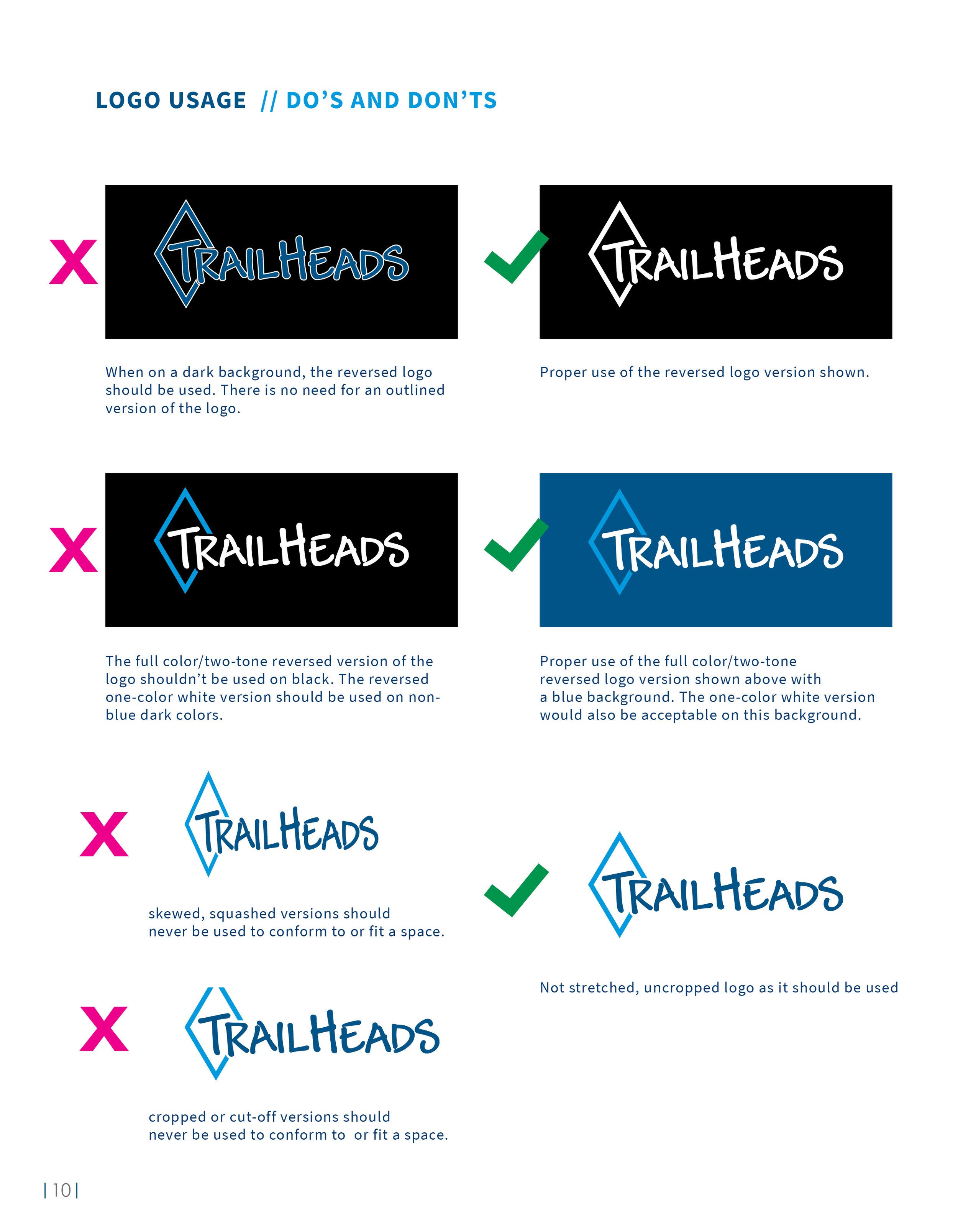
Below is the brand guidelines that were designed to provide direction with the new website and future projects. This was one of the larger brand guidelines I’ve done recently, so I removed some pages as to not make you scroll for a decade. I made it an interactive pdf with each section navigation being a live button and making it easier to navigate. The document talks everything from spacing, to color profiles, typography direction and branding examples.

apparel-company-brand-guidelines-design-by-jordan-fretz-design-1.jpg
apparel-company-brand-guidelines-design-by-jordan-fretz-design-13.jpg
apparel-company-brand-guidelines-design-by-jordan-fretz-design-15.jpg
apparel-company-brand-guidelines-design-by-jordan-fretz-design-17.jpg
apparel-company-brand-guidelines-design-by-jordan-fretz-design-19.jpg
apparel-company-brand-guidelines-design-by-jordan-fretz-design-111.jpg
apparel-company-brand-guidelines-design-by-jordan-fretz-design-114.jpg
apparel-company-brand-guidelines-design-by-jordan-fretz-design-118.jpg
apparel-company-brand-guidelines-design-by-jordan-fretz-design-120.jpg
apparel-company-brand-guidelines-design-by-jordan-fretz-design-12.jpg
apparel-company-brand-guidelines-design-by-jordan-fretz-design-14.jpg
apparel-company-brand-guidelines-design-by-jordan-fretz-design-16.jpg
apparel-company-brand-guidelines-design-by-jordan-fretz-design-18.jpg
apparel-company-brand-guidelines-design-by-jordan-fretz-design-110.jpg
apparel-company-brand-guidelines-design-by-jordan-fretz-design-112.jpg
apparel-company-brand-guidelines-design-by-jordan-fretz-design-117.jpg
apparel-company-brand-guidelines-design-by-jordan-fretz-design-119.jpg
apparel-company-brand-guidelines-design-by-jordan-fretz-design-121.jpg
apparel-amazon-page-layout-design-by-jordan-fretz-design-14.jpg

Once the new website is live I may have to make another post. Trailheads is great to work with and I’m always excited about the variety of their projects. Somehow they even let me design a glove :)

tags: brand refresh, logo refresh, logo guidelines design, logo standards manual, jordan fretz design, apparel brand logo design, apparel design refresh, brand standards design, logo brand guidelines, logo tweaks, logo update, professional logo refresh, professional brand refresh
Sunday 11.18.18
Posted by Jordan Fretz
 

ELITE SOCCER TRAINING STARTS HERE

On my sports identity and branding site (customsportslogo.com), I do a lot of badge and crest designs for various teams, leagues and clubs. I love doing sports design and the fact that I get creative requests after someone sees my work online is very rewarding. Since many of my requests are crest designs (most of the time soccer related) I have a standard price and process for that type of work. Level Up, on the other hand, wanted more of a brand logo and emblem that could be used at their newly acquired elite performance training facility. The logo would need to feel elite and work well with environmental graphics that were going up all over the interior of the building.

What an exciting project to work on with a lot of energy behind it as the training center is starting to come together. For this project I used a set of initial stylescapes to guide direction. Rather than showing multiple logo design concepts going every which way, I wanted to have a clear direction in moving forward and develop concepts that would be on target from the start. To accomplish this, I showed six different stylescape directions I named: Grit, Overlay, Monoline, Modern/Simple, Elite/Crest and Flat Dimension. In these stylescapes I showed a mood board or two of look/feel directions also that would give a sense of environmental graphics that would fit with the brand style. The styles capes consisted of examples and designs that fit the description well and also could provide inspiration or discussion for the direction of Level Up.

The two directions that the client gravitated to were as follows: Grit and Elite/Crest. The Elite/Crest style really lends itself to soccer branding and design. It quickly relates to an overall soccer style and then with the incorporation of grit, I could see the style having a cross-fit style pinch to it.

Level Up Soccer Stylescapes2.jpg
Level Up Soccer Stylescapes3.jpg
Level Up Soccer Stylescapes4.jpg
Level Up Soccer Stylescapes9.jpg
Level Up Soccer Stylescapes10.jpg
Level Up Soccer Stylescapes11.jpg

The initial concepts really hit the mark with the stylescape direction and thought the timeline for this project was pretty aggressive. Taking the time to do them was very helpful. I show below two of my initial concepts that were the top design variations by the client. After some discussion I went to work on the direction of keeping the lion head and crown but incorporating the hint of an “L” shape in the emblem. The coloring and typography was preferred in the second layout and having a responsive, engaged client really made the refining process fun for me.

jordan-fretz-design-custom-soccer-academy-logo-design-initial-concepts.jpg

As you can see, I created many styles of both the lion face and hinted “L” incorporation, some much more prominent than others. While I show multiple versions below, just know I did many many more till I felt confident I had a good direction. Spoiler alert (the first head won) and the final logo had both vertical orientation and horizontal orientation layouts for various uses.

custom-soccer-academy-logo-design-evelolution-designs-by-jordan-fretz-1.jpg
custom-soccer-logo-design-for-level-up-soccer-academy-1.jpg
custom-soccer-logo-design-for-level-up-soccer-academy-3.jpg
custom-soccer-logo-design-for-level-up-soccer-academy-2.jpg
custom-soccer-logo-design-for-level-up-soccer-academy-4.jpg
sports-branding-design-element-by-jordan-fretz.jpg

Besides just the logo design itself, Level Up was interested in branding elements, brand standards for guidance going forward and other materials to come. Their program is designed to have various color represented levels to it and I used that concept in their brand elements as well. The angled color bars add movement and give a splash of color when used in layouts.

The brand guidelines shown below give direction and organize color profile information, typography guidance, preferred logo use and some helpful spacing suggestions. I try never to make the brand standards too restrictive, but create them as more of a guide to develop the branding around. Since the grunge elements in the logo can be problematic in a few production types, I also provided clean versions for use in those cases. Having a designer who really thinks through future usage can really help a brand get started on the right foot rather than having to rethink things in a couple years after everything has become watered down or disjointed. All in all this was a great project, process and a fun client to work with.

 
sports-brand-standards-manual-design-by-jordan-fretz-for-level-up-soccer.jpg
sports-brand-standards-manual-design-by-jordan-fretz-for-level-up-soccer2.jpg
sports-brand-standards-manual-design-by-jordan-fretz-for-level-up-soccer6.jpg
sports-brand-standards-manual-design-by-jordan-fretz-for-level-up-soccer3.jpg
sports-brand-standards-manual-design-by-jordan-fretz-for-level-up-soccer7.jpg
sports-brand-standards-manual-design-by-jordan-fretz-for-level-up-soccer5.jpg
sports-brand-standards-manual-design-by-jordan-fretz-for-level-up-soccer4.jpg
sports-brand-standards-manual-design-by-jordan-fretz-for-level-up-soccer9.jpg
tags: sports branding, sports logo design, custom soccer logo, soccer training, brand standards design, logo guidelines design, soccer identity, sports identity design, sports brand standards, soccer brand standards, custom sports logo design
Sunday 11.18.18
Posted by Jordan Fretz
 

THE MOST EXPENSIVE COFFEE SLEEVE EVER

Well my art show went well and while I’m not going to go into a lot of detail on the mediums I used or talk through everything I did (for that go follow my instagram @jordanfretzart), but I did want to show some pics and a few stories.

Art has always been a way to relax for me. I have a huge passion for logo/identity design, branding and advertising, but at the end of the day sometimes it’s just nice to get off the computer and create. I draw with charcoal pencils on salvaged cardboard, I use watercolor paper for ink wash paintings and even did some metallic washes on antique piano scrolls. Sure I did some oil paintings, but I love doing art you may not typically see and I have fun doing quick creative drawings for Instagram when I can too.

I never planned on doing shows or selling off prints. That being said, I hope to teach Sawyer to take some risks, chances and just try stuff. This for me has been me trying stuff, taking a stab at doing something different and it’s been really rewarding.

My goal was to relax and find rest in creating with something other than pixels, but that changed a bit after talking with Dan Lyles. Daniel and I have known each other for years before we got a chance to work together in the agency world. I like his entrepreneurial spirit and his appreciation for all things creative or inspired. One thing about the agency I am at, Jackson Marketing, is they are encouraging with our side passion projects as well. I had done a couple pieces for charity auctions in the past and Daniel ran his first local art auction with myself included as an artist. It was a fun event and I sold some canvas prints. My next step up into the art world was in our agencies gallery. Jackson has a small gallery space for 14 pieces or so when you walk into the agency and I’d always thought it would be cool to show my work there. Well, after some drawings, paintings and a lot of scavenged cardboard, I had my work up in January of 2018. Coworkers and even some visiting clients all gave positive remarks and I was excited just to have some people appreciate the work.

Fast forward to September and Dan got the opportunity to have a space in downtown Greenville off Main Street. The space is down stairs right off the street and has space for 50 or so pieces. I helped by designing the logo for the Gallery. The “L” in the negative space was simple and the inspiration was a frame going on a piece of art.

When Dan talked to me about being a featured artist, I have to admit I was pumped, but nervous to get everything done. Thanks to an amazing wife and a son who sat with me many times I was painting/drawing, it all came together. I didn't want it to be like most of the other artists shows Daniel may have there or that are showing at other galleries, so we did a few fun things. We used pieces of cardboard for pricing, the titles of the works were funny/different and the most expensive piece in the show was a coffee cup sleeve. Where most artists will have their signature on the wall, mine was on a piece of cardboard and my artist statement was shredded as a nod to Banksy. Who reads the full statement anyway? See some of the pieces in the show and a few pictures from the event below. I included some captions throughout.

dan-lyles-gallery-logo-design-by-jordan-fretz.jpg
Currently Dan is getting spot lights and various artists/mediums hanging in this front, window space.

Currently Dan is getting spot lights and various artists/mediums hanging in this front, window space.

After working on Ink Wash paintings, the metallic ink in the glasses themselves looked cool, but was a pain to get off after :)

After working on Ink Wash paintings, the metallic ink in the glasses themselves looked cool, but was a pain to get off after :)

Some of the signage for the show posted around our offices and locally.

Some of the signage for the show posted around our offices and locally.

canvas-to-cardboard-art-show-jordan-fretz-art-30.jpg
canvas-to-cardboard-art-show-jordan-fretz-art-37.jpg
Special thanks to Palmetto Graphics for printing the prints everyone got at the door when attending the show

Special thanks to Palmetto Graphics for printing the prints everyone got at the door when attending the show

canvas-to-cardboard-art-show-jordan-fretz-art-1.jpg
canvas-to-cardboard-art-show-jordan-fretz-art-18.jpg
Antique player piano scroll Metallic Ink Wash Painting with a gold matte behind it

Antique player piano scroll Metallic Ink Wash Painting with a gold matte behind it

canvas-to-cardboard-art-show-jordan-fretz-art-6.jpg
This painting started off with an orange sky and a swordfish. I didn’t like it and ended up painting over it all. I like to tell people there is a fish under the water. It’s true a fish really is under there, a stupid swordfish!

This painting started off with an orange sky and a swordfish. I didn’t like it and ended up painting over it all. I like to tell people there is a fish under the water. It’s true a fish really is under there, a stupid swordfish!

Talking inspiration for pieces in the show and some info on the gallery. Sawyer even picked out a name out of the box for someone to win a small original!

Talking inspiration for pieces in the show and some info on the gallery. Sawyer even picked out a name out of the box for someone to win a small original!

canvas-to-cardboard-art-show-jordan-fretz-art-10.jpg
The inspiration of this piece was while hunting. Many times I almost wish a deer into existence walking in the trees. This one has a hazy tan figure moving in the bottom. Is it a deer or just imagination.

The inspiration of this piece was while hunting. Many times I almost wish a deer into existence walking in the trees. This one has a hazy tan figure moving in the bottom. Is it a deer or just imagination.

Lion and the Lamb

Lion and the Lamb

Little guy made it through the whole show.

Little guy made it through the whole show.

canvas-to-cardboard-art-show-jordan-fretz-art-16.jpg
canvas-to-cardboard-art-show-jordan-fretz-art-5.jpg
canvas-to-cardboard-art-show-jordan-fretz-art-42.jpg
canvas-to-cardboard-art-show-jordan-fretz-art-19.jpg
canvas-to-cardboard-art-show-jordan-fretz-art-26.jpg
The last cardboard piece finished before the show.

The last cardboard piece finished before the show.

Sawyer’s painting lessons started pretty early

Sawyer’s painting lessons started pretty early

canvas-to-cardboard-art-show-jordan-fretz-art-29.jpg
Special thanks to Jackson for letting me use their transit van to move everything

Special thanks to Jackson for letting me use their transit van to move everything

canvas-to-cardboard-art-show-jordan-fretz-art-40.jpg
canvas-to-cardboard-art-show-jordan-fretz-art-31.jpg
Getting ready for the show was fun, but I had so many guerrilla ideas I didn’t get done. Oh well there’s always tomorrow and one thing I love is no matter how stressful any situation is or tough day, this guy has a smile on. Most of the time :)

Getting ready for the show was fun, but I had so many guerrilla ideas I didn’t get done. Oh well there’s always tomorrow and one thing I love is no matter how stressful any situation is or tough day, this guy has a smile on. Most of the time :)

canvas-to-cardboard-art-show-jordan-fretz-art-13.jpg
canvas-to-cardboard-art-show-jordan-fretz-art-7.jpg
canvas-to-cardboard-art-show-jordan-fretz-art-25.jpg
We had it listed for 5k. It didn't sell :)

We had it listed for 5k. It didn't sell :)

canvas-to-cardboard-art-show-jordan-fretz-art-8.jpg
Artist Statement, Banksy style.

Artist Statement, Banksy style.

Fish scales done in metallic ink wash.

Fish scales done in metallic ink wash.

Probably my favorite piece in the show

Probably my favorite piece in the show

canvas-to-cardboard-art-show-jordan-fretz-art-12.jpg
Maybe my favorite thing about the show ended up seeing people reading the Anatomical posters and smiling at the callouts.

Maybe my favorite thing about the show ended up seeing people reading the Anatomical posters and smiling at the callouts.

canvas-to-cardboard-art-show-jordan-fretz-art-44.jpg
canvas-to-cardboard-art-show-jordan-fretz-art-22.jpg

I will have pieces up at the Dan Lyles Gallery throughout the year and hope to cycle more pieces in and out as time permits. Go check out the gallery: 123 S Main St Unit B, Greenville, SC 29601 opened from 10am-4pm weekdays and Saturdays. Check out the site that is ever evolving at danlylesgallery.com.

tags: jordan fretz art, jordan fretz artwork, jordan fretz, dan lyles gallery, dan lyles, greenville art gallery, greenville art scene, yeah that greenville, greenville south carolina, greenville south carolina art, greenville south carolina small business
Wednesday 11.14.18
Posted by Jordan Fretz
 

LABELS FOR LAWNS

Randomly ran into this product online the other week and they looked familiar :). Yep, I did these label designs a few years ago and though I probably wouldn’t go to the gradient again, I did blur some grass imagery for the backdrop so that makes me feel a little better about them. It couldn’t be any more ironic for me to design lawn care product labels. My back yard looks like I’ve been putting forth real effort to actually destroy all signs of healthy grass. Anyway, the product labels needed to have a unified look across the series of products and also reflect the modern Lawnifi look. One challenge was making sure all the content sections were included, but also broken up into digestible pieces. That can be a challenge with so many details, benefits and suggestions. All in all, the final labels tell the story they need to and hopefully they help buyers improve their lawn.

product-label-design-jordan-fretz-3.jpg
7.jpg
product-label-design-jordan-fretz-2.jpg
5.jpg
product-label-design-jordan-fretz.jpg
6.jpg
tags: custom label design, package design, product label design
Tuesday 11.13.18
Posted by Jordan Fretz
 

AIR STARTERS. I'M CONFUSED.

I won’t even begin to act like I know how the air starters work. I know the images seem complicated and I’m no engineer, but after talking through the project that may be a good thing. There isn’t anyone alive who could explain exactly how the process works in a logo. Thank goodness logos don’t have to be literal. Many people try to make them that way, but to create a simple memorable mark always is best and that’s what I sought out to do.

2.jpg
3.png
4.png

For this project, I broke down some components from engines and starters alike. The fan is an interesting component visually to me and with some evolution, I used the shape to morph into a bird which just makes sense with the name :).

logo-design-process-by-jordan-fretz-design.jpg

The final logo was coupled with a crest-like shape and I liked having the mark placed in the upper corner of the text like it was about to take off. My suggestion for identity materials and branding going forward is to use a red foil stamp, where appropriate, with a flat black backdrop.

jordan-fretz-logo.jpg
logo-design.jpg
5.jpg
tags: logo design, jordan fretz design, engine logo design, engineer design
Monday 11.12.18
Posted by Jordan Fretz
 

NATURALY REBRANDED

I head about Greenville Natural Health from a co-worker who had seen them in the past for some health issues. After looking through their site and seeing some of their materials, I knew A. this is a place that would help my own digestive problems post Lyme Disease and B. this is a place that would use a bit of branding help and a refresh. I have been to other natural health practices before as the typical routes for recovery weren't helping me as much as I had hoped. I was directed from one specialist to another specialist, to another and taken so many antibiotics with no end in site. 

712.jpg

Upon going to visit with Marina, right away, I could tell this was going to be a good experience. Not only did Marina take time to listen to my story and talk through what has helped and hurt, she seemed to care and understand. Like many small businesses that are now looking to grow and take the next step, Greenville Natural Heath could use a brand refresh. There wasn't a polished look to many of their items and I wanted to start to create branding that would not only be consistent across their business but also bring a more current look. After all, the team does some techniques and treatments that are cutting edge and they should have a clean, modern feel.

I got to work, creating various styles and looks that could be flexible but easily recognized as the brand extends onto apparel, sponsorships, collateral and advertising. I even questioned having "Greenville" before the other wording or after. For some reason I could see it being said both ways and thought it was worth discussing.

greenville-natural-health-rebrand-design-by-jordan-fretz-3.jpg

Since the business has Greenville right up front in the name and previously in the logo it was so prominent, I thought it would make sense to have a visual that could play off Greenville's staple, the bridge. It just makes sense to incorporate if we could. My thought was that if the sticker is seen on cars, or around town, residents would feel more inclined to wear it or notice it because it feels local. 

As you can see I created a simple vector graphic representation of the bridge and used a leaf to communicate the natural or health side of the business. I liked the green and blue color scheme as it seems relaxed but still had quite a bit of contrast. The blue incorporation was a jump from the previous branding, but after looking at a few color swatches I think was a smart move.

greenville-south-carolina-bridge.jpg
greenville-natural-health-rebrand-design-by-jordan-fretz-5.jpg

When creating the various orientations, I started exploring an abbreviation for Greenville. I thought GVL would feel more modern and locally I think more people would still recognize the abbreviation. It created a slightly simpler look when handling the type which I liked as well. In the end I provided both versions, spelled out and abbreviated. What is being discussed is using Greenville until it's full¥ established with the new branding and then down the road transitioning or at least revisiting the abbreviation. With SEO and other considerations, it's maybe too big of a switch at this time.

greenville-natural-health-rebrand-design-by-jordan-fretz.jpg

I included this next image to illustrate just how many files I create for a logo project. There are full color, reversed full color, outline, reversed outline, grayscale, reversed grayscale, one color black and finally, reversed one color. This is just for one of the badges, then I did both horizontal and vertical orientations with both Greenville and GVL. Cheap designers or crowdsourcing sites would give you the full color version and event then who knows what filetypes of them, but when you choose a professional designer, they should be giving you professional, clean files with many forms for use. Vendors will thank you,  your layouts won't be blurry and it will make your brand look more professional.

greenville-natural-health-rebrand-design-by-jordan-fretz-6.jpg

Stickers for bottles, and all types of collateral materials are being developed and below are a few branding elements I have started developing. A few of the explored sticker directions are shown here. The small stickers are for the tops of bottles and the large one is for wrapping on the side of the bottle and indicating dosage.

The avocado is the first of many icons being developed to represent Greenville Natural Health service offerings. Using the simple outline style works well with the new logo and is a more modern approach than full color graphics with drop shadows.

I also created a leaf pattern to be used and have already overlaid the pattern on photos for key visuals on a presentation and plan on using the pattern to add a texture on various branded items. 

All in all, a fun start to a rebrand and it's exciting to work on a refresh for a business that helps people get back on track with their health!.

greenville-natural-health-rebrand-design-by-jordan-fretz-stickers.jpg
greenville-natural-health-rebrand-design-by-jordan-fretz-4.jpg
tags: natural health, natural health logo, natural health logo design, health logo design, natural health doctor logo design, natural health rebrand, rebranding natural health logo, modern rebrand, greenville natural health, greenville south carolina, greenville south carolina small business, greenville south carolina rebrand
Wednesday 07.25.18
Posted by Jordan Fretz
 

VOTE CLEAN TEETH

With all the elections going on here, it seems every intersection is filled with signs. Lately, I've really been trying to think more strategic for my freelance clients and this seemed like a perfect opportunity to stand out in a sea of the same. Each candidate has signs displayed back to back to back. Yeah your running for office, we got it after the first ten signs.

I sent my dentist a mockup around 10pm showing a sign with his name (which is also his practice name) "for dentist." He liked the idea and by lunch the next day, I was uploading the final layout for printing signs. Twenty-five signs were placed along Haywood and Woodruff Road, leading right to his office location with another sign out front. 

Ben's office received phone calls, they heard some buzz at the pole lines and attributed seven or so new patients to the advertising. I always want to be creating work that both stands out and gets attention, but it's really satisfying to hear when that work also produces results. 

vote-guerilla-marketing-Ben-Daniel-for-dentist-no mockup.jpg
vote-guerilla-marketing-Ben-Daniel-for-dentist-2.jpg
vote-guerilla-marketing-Ben-Daniel-for-dentist-1.jpg
vote-guerilla-marketing-Ben-Daniel-for-dentist-3.jpg
tags: vote, dentist advertising, voting signs, vote for clean teeth, guerilla advertising, guerilla marketing, outdoor design, guerilla design, dentistry advertising, dentist marketing
Tuesday 06.26.18
Posted by Jordan Fretz
 
Newer / Older

copyright jordan fretz design