• about
  • contact
  • blog
jordan fretz design | freelance graphic design & art direction | branding & logo design
  • about
  • contact
  • blog

INKTOBER COMPLETE & MADE THE JOURNAL

greenville journal feature jordan fretz art.jpg

I’ve always wanted to do INKTOBER. I got on Instagram as a creative break from the computer and I just wanted to do some random illustration stuff. In that sense, INKTOBER is exactly what I was looking for. A 31 day challenge using a prompt list and joining a community of illustrators/artists in doing so. Anyway, see all the days illustrations/interactive art I did on my Instagram @jordanfretzart.

Pretty cool the Greenville Journal took notice of some of the work and wrote a cool article in printed and digital form. See the article online on their site here: Greenville Journal Article.

final01.jpg
jordan-fretz-design-interactive-art-final-2.jpg
final-2.jpg
final+freeze+3-final.jpg
final-3-fr2.jpg
rise from the ashes.jpg
Jordan Fretz-Mason Interactive Cardboard Art.jpg
tags: greenville south carolina, graphic design, custom illustration, jordan fretz art, greenville journal feature, artists in greenville south carolina, yeah that greenville, inktober, inktober challenge
Tuesday 11.12.19
Posted by Jordan Fretz
 

TAKE YOUR FREELANCE UNDERGROUND

I love freelancing at coffee shops. I did it waaaaaay more before kids,, but my favorite spot to go was Coffee Underground. I've always loved there location downtown, setup, food etc. but their logo/signage could use an refresh!! While so many customers and Greenville natives love this place, I can’t remember seeing shirts, vehicle stickers, or other branded elements around town. They should have loads of stickers on customers vehicles, laptops, coolers, sweater vests (Too far?). THE PLACE IS AWESOME. Anyway, I put together a little proposal with a new logo design and a few ideas for using coffee sleeve art (you can see some on my instagram @jordanfretzart). Taking a few minutes to put together a proposal for some work I’d love to do, for a place i’d love to do it for felt like a great use of time. It’s always tricky to know where to send something like this, how to get it to the right person and not come across like a tool, etc. Besides sending online and hitting up their social accounts, I drew the Liberty Bridge downtown on a coffee sleeve and cut a hole in the cup lid giving room to insert a rolled up printed proposal and dropped it off for the owner. You never know, but it would be a cool story to do a bit of freelance for a place I’ve always loved to freelance at.

coffee-underground-rebrand-concept-by-jordan-fretz-7.jpg
coffee-underground-rebrand-concept-by-jordan-fretz-81.jpg
coffee-underground-rebrand-concept-by-jordan-fretz-3.jpg
Yeah that greenville coffee art
tags: yeah that greenville, greenville south carolina, coffee underground, coffee underground rebrand, coffee culture, greenville coffee culture, greenville south carolina coffee
Tuesday 09.10.19
Posted by Jordan Fretz
 

REVITALIZING POE MILL

Poe Mill once was a booming area from 1897 to 1977; it’s milll was producing cotton fabric and thriving. The building burned in 2003 leaving only 2 smoke stacks as reminders of the past. Griggs Church has been serving the area since 1936. As the neighborhood declined over time, the church also dwindled down. In 2015, pastor Mitch Miller was called to the church with only a handful of adults and kids still in attendance. A revitalization effort began at this time, and recently Griggs has seen nearly 90 for a Sunday morning service. While the church is more than 80-years-old, we’ve had a large percentage of young people come in and  breath new life into the church while reaching the neighborhood. A pretty cool story to lead a rebrand!!

If you look closely, you can see a small weed/plant growing out of one of those old smoke stacks. This sparked the idea of a flourishing, growing plant reflective of Griggs new growth and the goal of revitalizing the neighborhood. There a tons of great, large churches in Greenville, but it’s been a rewarding experience to see a small church rebuilding and assisting a community who needs it. Anyway, it was fun to work on the rebrand, see the logo coming to life on materials, shirts at events etc. If you happen to be in Greenville, visit the church on Pointsett Highway, everyone would love to meet you.

Griggs-rebrand-jordan-fretz-12.jpg
Griggs-rebrand-jordan-fretz-13.jpg
Griggs-rebrand-jordan-fretz-15.jpg
Griggs-rebrand-jordan-fretz-11.jpg
Griggs-rebrand-jordan-fretz-5.jpg
Griggs-rebrand-jordan-fretz-10.jpg
Griggs-rebrand-jordan-fretz-4.jpg
griggs11.jpg
by itself.jpeg
gm2.jpeg
IMG_5944.jpeg
IMG_6765.jpeg
Griggs-rebrand-jordan-fretz-7.jpg
Griggs-rebrand-jordan-fretz-9.jpg
Griggs-rebrand-jordan-fretz-8.jpg
griggs-church-site-home.jpg
gm3.jpeg
IMG_0362.jpeg
IMG_5945.jpg
IMG_6769.jpg
IMG_0364.jpeg
tags: church logo design, logo design, greenville south carolina, yeah that greenville, poe mill, poe mill south carolina, poe mill greenville south carolina, graphic design, identity design
Wednesday 06.05.19
Posted by Jordan Fretz
 

THE MOST EXPENSIVE COFFEE SLEEVE EVER

Well my art show went well and while I’m not going to go into a lot of detail on the mediums I used or talk through everything I did (for that go follow my instagram @jordanfretzart), but I did want to show some pics and a few stories.

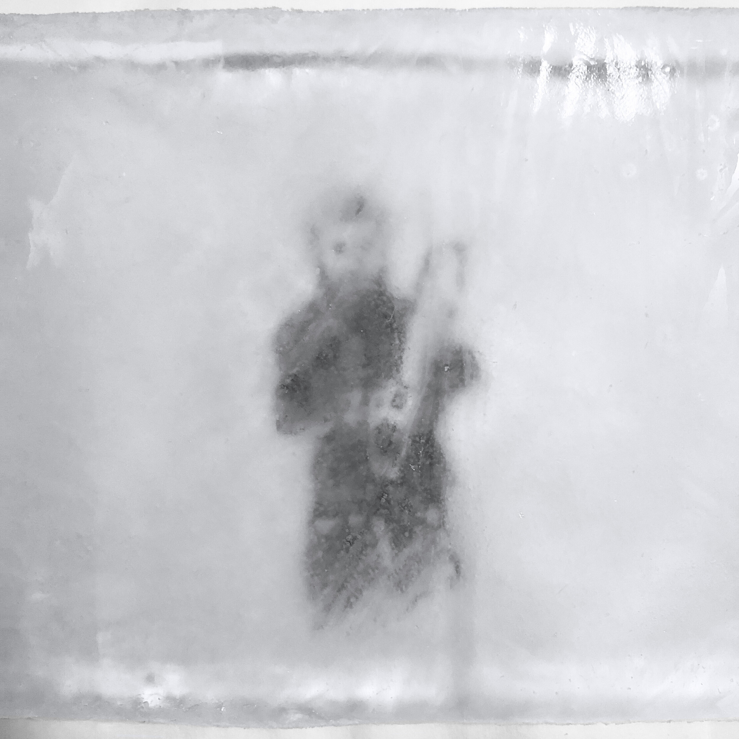
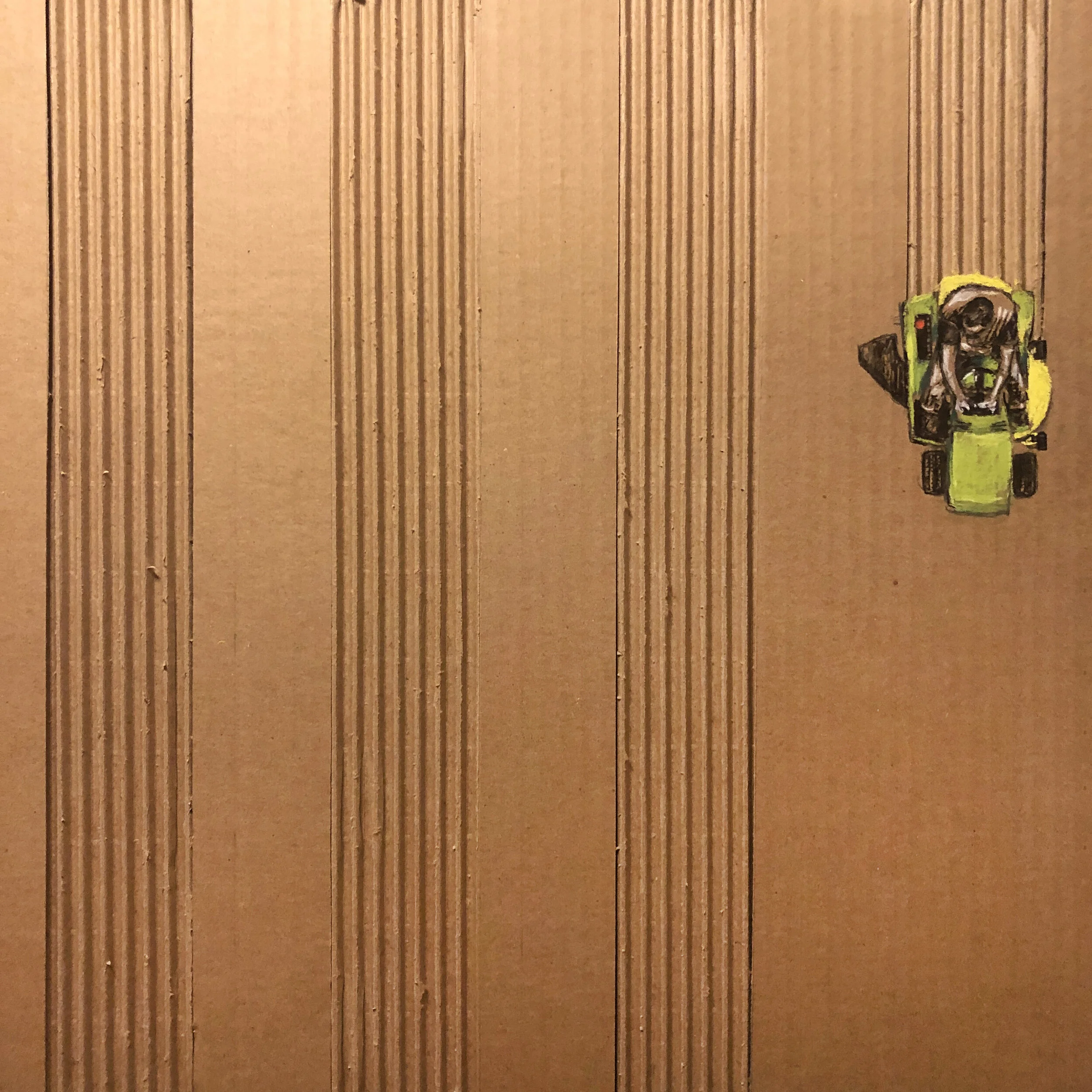
Art has always been a way to relax for me. I have a huge passion for logo/identity design, branding and advertising, but at the end of the day sometimes it’s just nice to get off the computer and create. I draw with charcoal pencils on salvaged cardboard, I use watercolor paper for ink wash paintings and even did some metallic washes on antique piano scrolls. Sure I did some oil paintings, but I love doing art you may not typically see and I have fun doing quick creative drawings for Instagram when I can too.

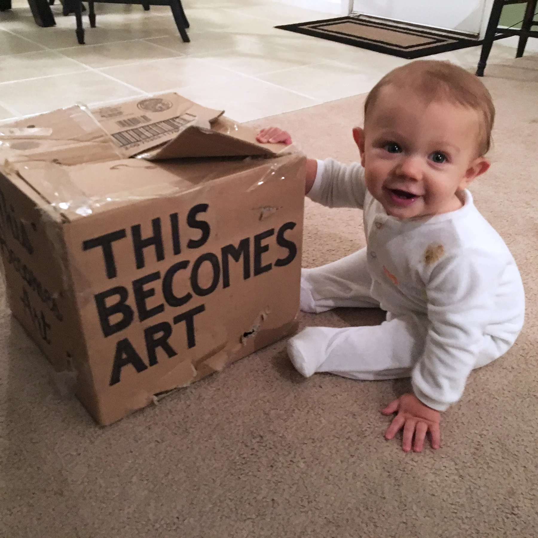
I never planned on doing shows or selling off prints. That being said, I hope to teach Sawyer to take some risks, chances and just try stuff. This for me has been me trying stuff, taking a stab at doing something different and it’s been really rewarding.

My goal was to relax and find rest in creating with something other than pixels, but that changed a bit after talking with Dan Lyles. Daniel and I have known each other for years before we got a chance to work together in the agency world. I like his entrepreneurial spirit and his appreciation for all things creative or inspired. One thing about the agency I am at, Jackson Marketing, is they are encouraging with our side passion projects as well. I had done a couple pieces for charity auctions in the past and Daniel ran his first local art auction with myself included as an artist. It was a fun event and I sold some canvas prints. My next step up into the art world was in our agencies gallery. Jackson has a small gallery space for 14 pieces or so when you walk into the agency and I’d always thought it would be cool to show my work there. Well, after some drawings, paintings and a lot of scavenged cardboard, I had my work up in January of 2018. Coworkers and even some visiting clients all gave positive remarks and I was excited just to have some people appreciate the work.

Fast forward to September and Dan got the opportunity to have a space in downtown Greenville off Main Street. The space is down stairs right off the street and has space for 50 or so pieces. I helped by designing the logo for the Gallery. The “L” in the negative space was simple and the inspiration was a frame going on a piece of art.

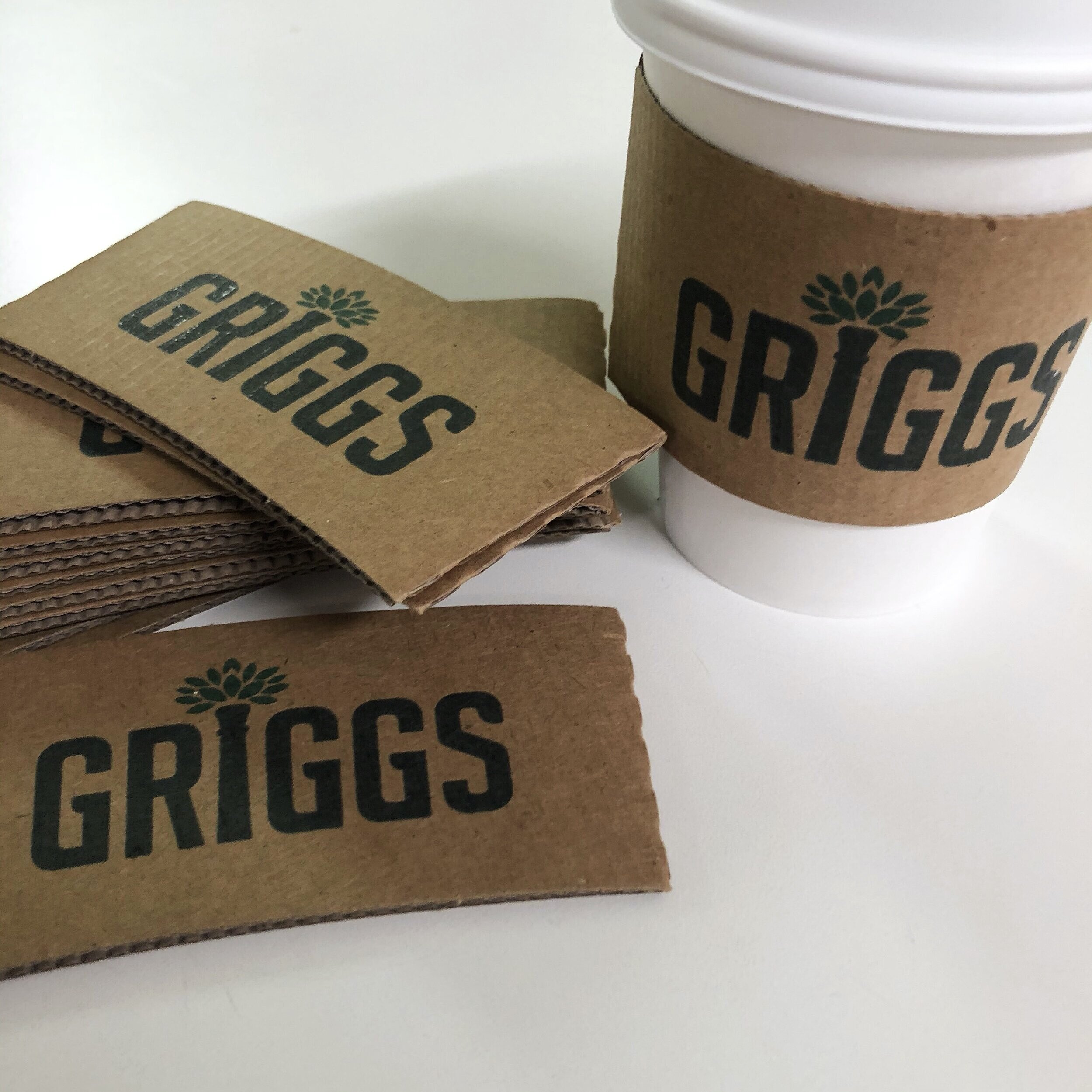
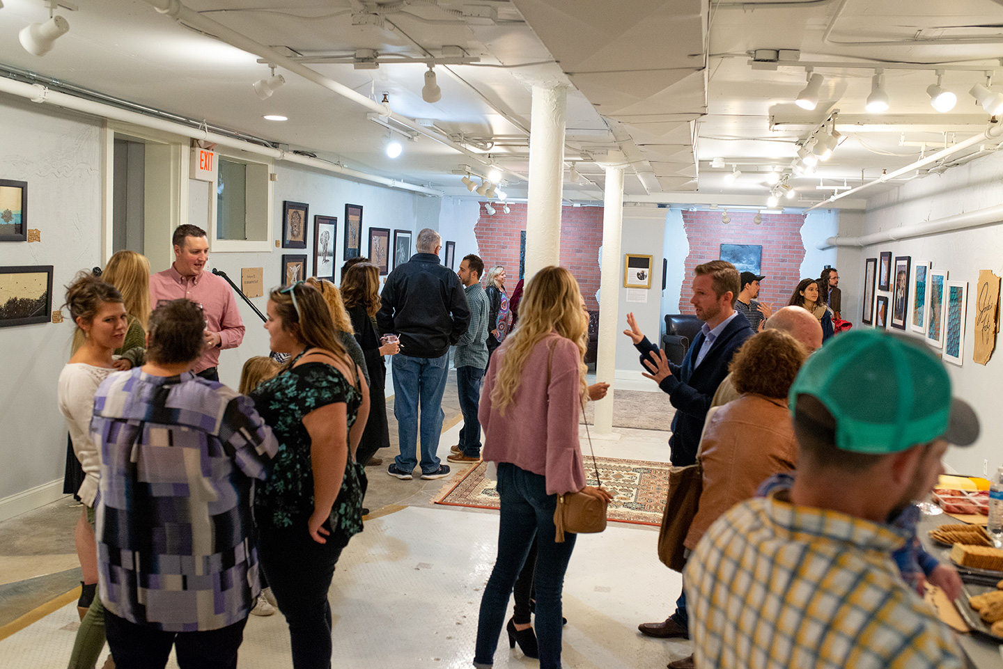
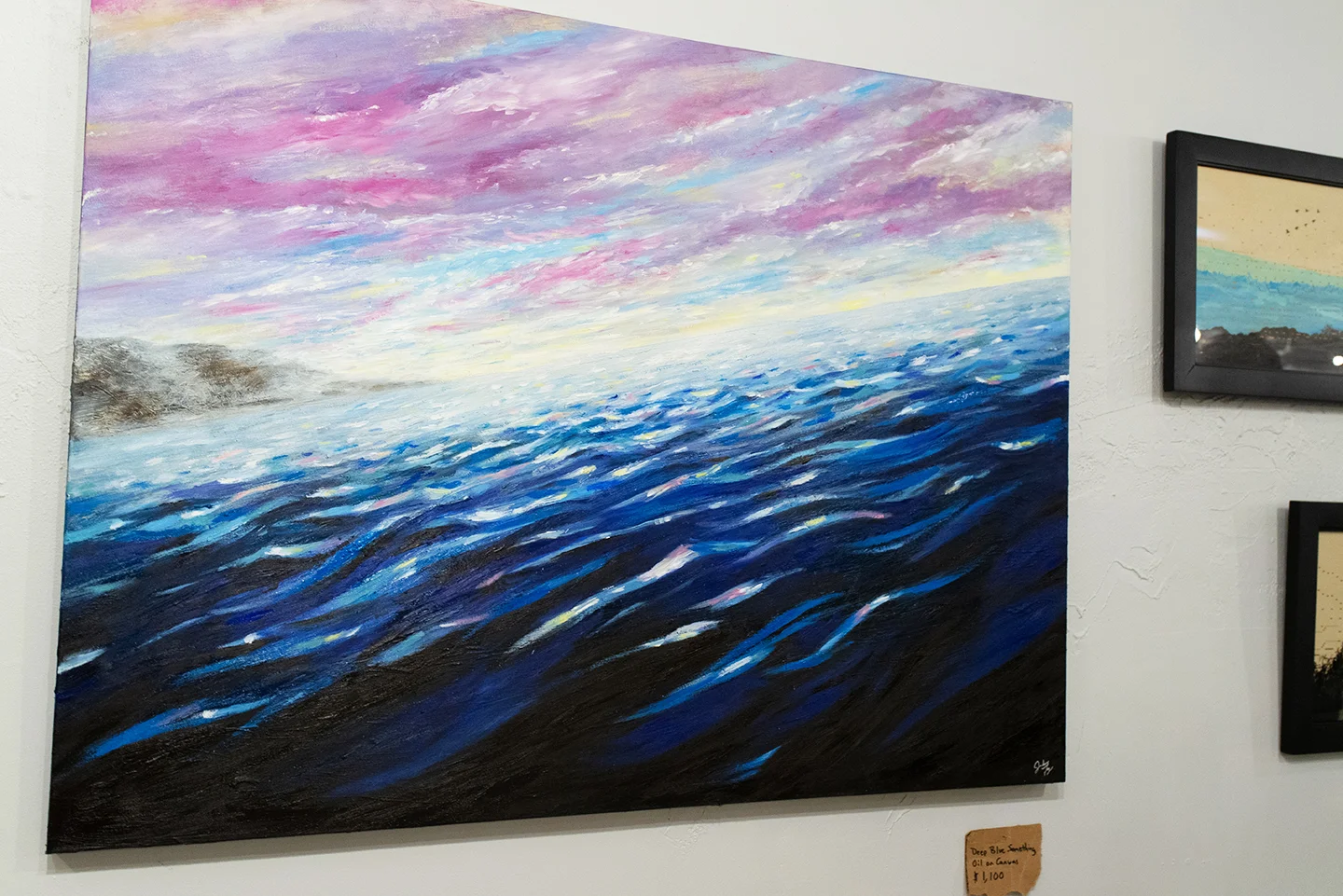
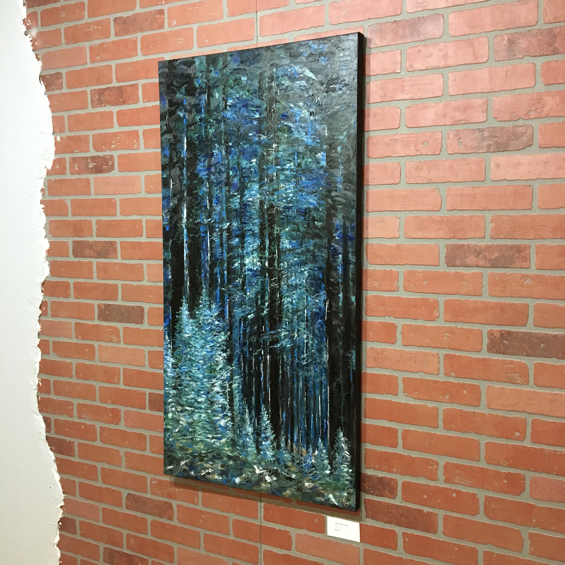
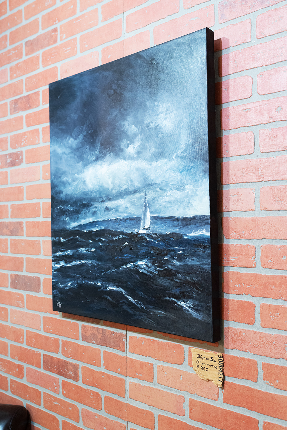
When Dan talked to me about being a featured artist, I have to admit I was pumped, but nervous to get everything done. Thanks to an amazing wife and a son who sat with me many times I was painting/drawing, it all came together. I didn't want it to be like most of the other artists shows Daniel may have there or that are showing at other galleries, so we did a few fun things. We used pieces of cardboard for pricing, the titles of the works were funny/different and the most expensive piece in the show was a coffee cup sleeve. Where most artists will have their signature on the wall, mine was on a piece of cardboard and my artist statement was shredded as a nod to Banksy. Who reads the full statement anyway? See some of the pieces in the show and a few pictures from the event below. I included some captions throughout.

dan-lyles-gallery-logo-design-by-jordan-fretz.jpg
Currently Dan is getting spot lights and various artists/mediums hanging in this front, window space.

Currently Dan is getting spot lights and various artists/mediums hanging in this front, window space.

After working on Ink Wash paintings, the metallic ink in the glasses themselves looked cool, but was a pain to get off after :)

After working on Ink Wash paintings, the metallic ink in the glasses themselves looked cool, but was a pain to get off after :)

Some of the signage for the show posted around our offices and locally.

Some of the signage for the show posted around our offices and locally.

canvas-to-cardboard-art-show-jordan-fretz-art-30.jpg
canvas-to-cardboard-art-show-jordan-fretz-art-37.jpg
Special thanks to Palmetto Graphics for printing the prints everyone got at the door when attending the show

Special thanks to Palmetto Graphics for printing the prints everyone got at the door when attending the show

canvas-to-cardboard-art-show-jordan-fretz-art-1.jpg
canvas-to-cardboard-art-show-jordan-fretz-art-18.jpg
Antique player piano scroll Metallic Ink Wash Painting with a gold matte behind it

Antique player piano scroll Metallic Ink Wash Painting with a gold matte behind it

canvas-to-cardboard-art-show-jordan-fretz-art-6.jpg
This painting started off with an orange sky and a swordfish. I didn’t like it and ended up painting over it all. I like to tell people there is a fish under the water. It’s true a fish really is under there, a stupid swordfish!

This painting started off with an orange sky and a swordfish. I didn’t like it and ended up painting over it all. I like to tell people there is a fish under the water. It’s true a fish really is under there, a stupid swordfish!

Talking inspiration for pieces in the show and some info on the gallery. Sawyer even picked out a name out of the box for someone to win a small original!

Talking inspiration for pieces in the show and some info on the gallery. Sawyer even picked out a name out of the box for someone to win a small original!

canvas-to-cardboard-art-show-jordan-fretz-art-10.jpg
The inspiration of this piece was while hunting. Many times I almost wish a deer into existence walking in the trees. This one has a hazy tan figure moving in the bottom. Is it a deer or just imagination.

The inspiration of this piece was while hunting. Many times I almost wish a deer into existence walking in the trees. This one has a hazy tan figure moving in the bottom. Is it a deer or just imagination.

Lion and the Lamb

Lion and the Lamb

Little guy made it through the whole show.

Little guy made it through the whole show.

canvas-to-cardboard-art-show-jordan-fretz-art-16.jpg
canvas-to-cardboard-art-show-jordan-fretz-art-5.jpg
canvas-to-cardboard-art-show-jordan-fretz-art-42.jpg
canvas-to-cardboard-art-show-jordan-fretz-art-19.jpg
canvas-to-cardboard-art-show-jordan-fretz-art-26.jpg
The last cardboard piece finished before the show.

The last cardboard piece finished before the show.

Sawyer’s painting lessons started pretty early

Sawyer’s painting lessons started pretty early

canvas-to-cardboard-art-show-jordan-fretz-art-29.jpg
Special thanks to Jackson for letting me use their transit van to move everything

Special thanks to Jackson for letting me use their transit van to move everything

canvas-to-cardboard-art-show-jordan-fretz-art-40.jpg
canvas-to-cardboard-art-show-jordan-fretz-art-31.jpg
Getting ready for the show was fun, but I had so many guerrilla ideas I didn’t get done. Oh well there’s always tomorrow and one thing I love is no matter how stressful any situation is or tough day, this guy has a smile on. Most of the time :)

Getting ready for the show was fun, but I had so many guerrilla ideas I didn’t get done. Oh well there’s always tomorrow and one thing I love is no matter how stressful any situation is or tough day, this guy has a smile on. Most of the time :)

canvas-to-cardboard-art-show-jordan-fretz-art-13.jpg
canvas-to-cardboard-art-show-jordan-fretz-art-7.jpg
canvas-to-cardboard-art-show-jordan-fretz-art-25.jpg
We had it listed for 5k. It didn't sell :)

We had it listed for 5k. It didn't sell :)

canvas-to-cardboard-art-show-jordan-fretz-art-8.jpg
Artist Statement, Banksy style.

Artist Statement, Banksy style.

Fish scales done in metallic ink wash.

Fish scales done in metallic ink wash.

Probably my favorite piece in the show

Probably my favorite piece in the show

canvas-to-cardboard-art-show-jordan-fretz-art-12.jpg
Maybe my favorite thing about the show ended up seeing people reading the Anatomical posters and smiling at the callouts.

Maybe my favorite thing about the show ended up seeing people reading the Anatomical posters and smiling at the callouts.

canvas-to-cardboard-art-show-jordan-fretz-art-44.jpg
canvas-to-cardboard-art-show-jordan-fretz-art-22.jpg

I will have pieces up at the Dan Lyles Gallery throughout the year and hope to cycle more pieces in and out as time permits. Go check out the gallery: 123 S Main St Unit B, Greenville, SC 29601 opened from 10am-4pm weekdays and Saturdays. Check out the site that is ever evolving at danlylesgallery.com.

tags: jordan fretz art, jordan fretz artwork, jordan fretz, dan lyles gallery, dan lyles, greenville art gallery, greenville art scene, yeah that greenville, greenville south carolina, greenville south carolina art, greenville south carolina small business
Wednesday 11.14.18
Posted by Jordan Fretz
 

NATURALY REBRANDED

I head about Greenville Natural Health from a co-worker who had seen them in the past for some health issues. After looking through their site and seeing some of their materials, I knew A. this is a place that would help my own digestive problems post Lyme Disease and B. this is a place that would use a bit of branding help and a refresh. I have been to other natural health practices before as the typical routes for recovery weren't helping me as much as I had hoped. I was directed from one specialist to another specialist, to another and taken so many antibiotics with no end in site. 

712.jpg

Upon going to visit with Marina, right away, I could tell this was going to be a good experience. Not only did Marina take time to listen to my story and talk through what has helped and hurt, she seemed to care and understand. Like many small businesses that are now looking to grow and take the next step, Greenville Natural Heath could use a brand refresh. There wasn't a polished look to many of their items and I wanted to start to create branding that would not only be consistent across their business but also bring a more current look. After all, the team does some techniques and treatments that are cutting edge and they should have a clean, modern feel.

I got to work, creating various styles and looks that could be flexible but easily recognized as the brand extends onto apparel, sponsorships, collateral and advertising. I even questioned having "Greenville" before the other wording or after. For some reason I could see it being said both ways and thought it was worth discussing.

greenville-natural-health-rebrand-design-by-jordan-fretz-3.jpg

Since the business has Greenville right up front in the name and previously in the logo it was so prominent, I thought it would make sense to have a visual that could play off Greenville's staple, the bridge. It just makes sense to incorporate if we could. My thought was that if the sticker is seen on cars, or around town, residents would feel more inclined to wear it or notice it because it feels local. 

As you can see I created a simple vector graphic representation of the bridge and used a leaf to communicate the natural or health side of the business. I liked the green and blue color scheme as it seems relaxed but still had quite a bit of contrast. The blue incorporation was a jump from the previous branding, but after looking at a few color swatches I think was a smart move.

greenville-south-carolina-bridge.jpg
greenville-natural-health-rebrand-design-by-jordan-fretz-5.jpg

When creating the various orientations, I started exploring an abbreviation for Greenville. I thought GVL would feel more modern and locally I think more people would still recognize the abbreviation. It created a slightly simpler look when handling the type which I liked as well. In the end I provided both versions, spelled out and abbreviated. What is being discussed is using Greenville until it's full¥ established with the new branding and then down the road transitioning or at least revisiting the abbreviation. With SEO and other considerations, it's maybe too big of a switch at this time.

greenville-natural-health-rebrand-design-by-jordan-fretz.jpg

I included this next image to illustrate just how many files I create for a logo project. There are full color, reversed full color, outline, reversed outline, grayscale, reversed grayscale, one color black and finally, reversed one color. This is just for one of the badges, then I did both horizontal and vertical orientations with both Greenville and GVL. Cheap designers or crowdsourcing sites would give you the full color version and event then who knows what filetypes of them, but when you choose a professional designer, they should be giving you professional, clean files with many forms for use. Vendors will thank you,  your layouts won't be blurry and it will make your brand look more professional.

greenville-natural-health-rebrand-design-by-jordan-fretz-6.jpg

Stickers for bottles, and all types of collateral materials are being developed and below are a few branding elements I have started developing. A few of the explored sticker directions are shown here. The small stickers are for the tops of bottles and the large one is for wrapping on the side of the bottle and indicating dosage.

The avocado is the first of many icons being developed to represent Greenville Natural Health service offerings. Using the simple outline style works well with the new logo and is a more modern approach than full color graphics with drop shadows.

I also created a leaf pattern to be used and have already overlaid the pattern on photos for key visuals on a presentation and plan on using the pattern to add a texture on various branded items. 

All in all, a fun start to a rebrand and it's exciting to work on a refresh for a business that helps people get back on track with their health!.

greenville-natural-health-rebrand-design-by-jordan-fretz-stickers.jpg
greenville-natural-health-rebrand-design-by-jordan-fretz-4.jpg
tags: natural health, natural health logo, natural health logo design, health logo design, natural health doctor logo design, natural health rebrand, rebranding natural health logo, modern rebrand, greenville natural health, greenville south carolina, greenville south carolina small business, greenville south carolina rebrand
Wednesday 07.25.18
Posted by Jordan Fretz
 

copyright jordan fretz design