
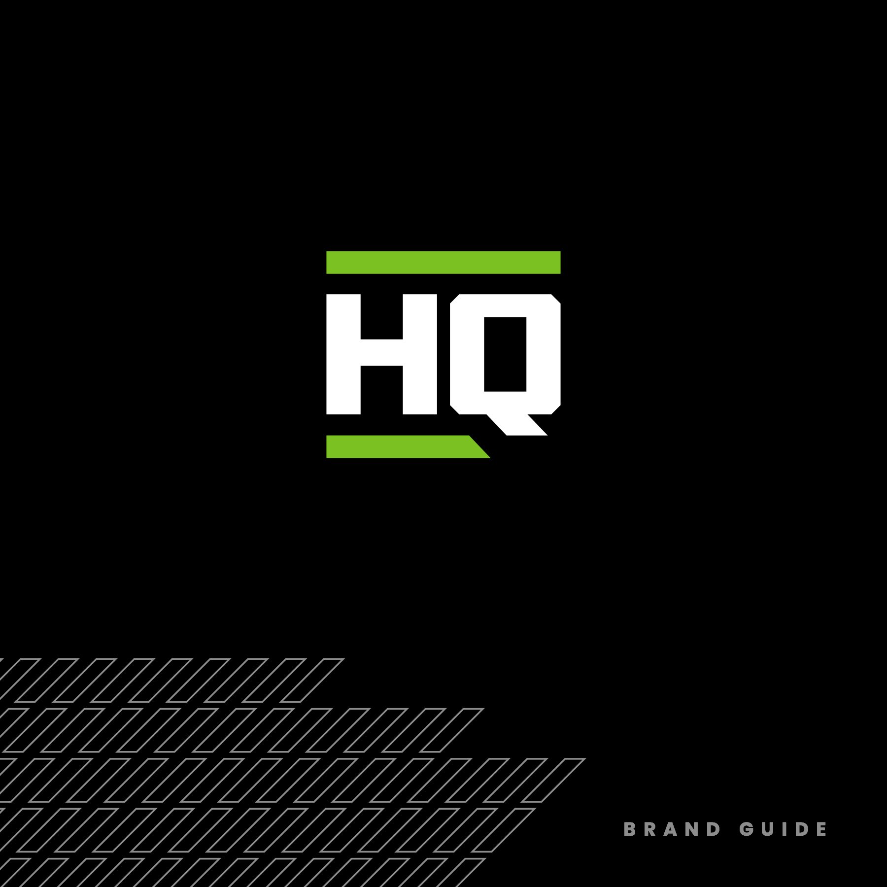
Testing tools in the real world is a heck of a lot different than saying they performed great in the lab or simulation. In the real world, there’s real outdoor elements, real rough conditions, real time that can’t be wasted, real guys and gals wanting products that can be trusted. TestedHQ takes products into the real world and gives them an actual score that can be analyzed and used to adapt final products. Ensuring a product isn’t just a great idea, it’s executed to perfection. We gave them a strong look and feel to match their market and used the “linking” concept to be used in explaining their benefits to clients. Real People. Real Perspectives. Real Results. Also I gave them a real brand guide and professional logo files. Always fun doing a rebrand and meeting new people, great group and a lot of fun to work with on this one.


THE HOPS RATTLE
Unused vector illustration concept for Pabst Blue Ribbon.

ONE OF MY FIRST FULL REBRANDS
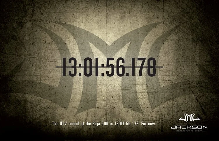
Being that it was in a cool industry and partnered with cool brands, the re-branding of Jackson Motorsports Group wasn't terribly difficult. They needed to have a style that would work both in the off-road and pavement racing markets. Oh, and it needed to be edgy.
I wanted to create a symbol that not only looked good, but also had a thought behind it. There aren’t many items more relevant to all forms of racing than a helmet. See how I got to the final mark, some of the branding pieces and a short video we used to launch it.
While the tribal style look didn’t stand the test of time and the branding was replaced years later, I learned a lot from the project and the symbol really was recognized in the motorsports track event space.
Art directed while at Jackson Marketing.


DARING TO BE GREAT
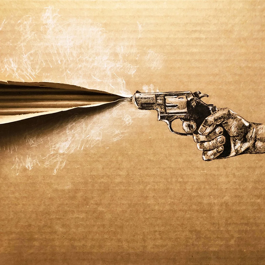
“Dare to Be Great” done on salvaged Corrugated material. Well, while trying to make a statement as a cardboard artist, I had a decent idea. Recreate famous works of art and the most expensive pieces ever created, but on salvaged cardboard (trash). Each famous/ recognizable work would be a slight parody with the corrugation peeking through. Also each work would have the artist names below them with the last piece being the least recognizable of course, mine. This Geoge Louis style concept I thought could both show off some art skill, creativity on corrugated reveal element inclusion and maybe put a little shine on my name also. Who knows where it will end up. I haven’t sold at this point and planned to enter into a competition, though I’m rethinking the best way to make a splash with the art. It begs for some sort of creative purpose. See the time-lapse replays on my Instagram!


TAGLINE / BRANDING / BRAND GUIDE / JUST GETTING EVERYONE ON THE SAME PAGE
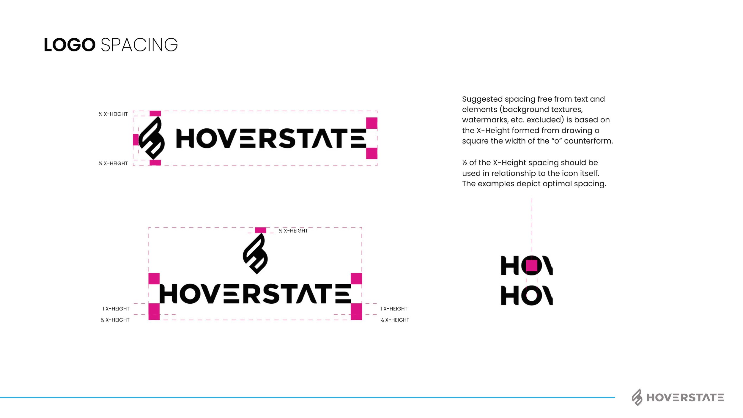
I think most of my clients have many brand pieces they need, but for some reason it helps having someone consolidate, bring it all together and unite around the vision. Does the kerning of the word mark matter, yep! Is the secondary color palette important to get right, yep! But more importantly than those things (and using proper grammar in this blog) is the voice and brand personality. I’m not going to explain this whole project as I do have a page on the work also now, but below are some of the assets and final brand guide I put together. We rallied the team around “Invent Tomorrow” as the tag and I think the brand voice we gave really fits well with the vision. The color palette, type style, assets and humanity elements helped push their CX, user first approach to business. See how I got to this point and the branding options shown by checking out the page here: Hoverstate Rebrand


SALVAGED CARDBOARD ART — INKTOBER 2021


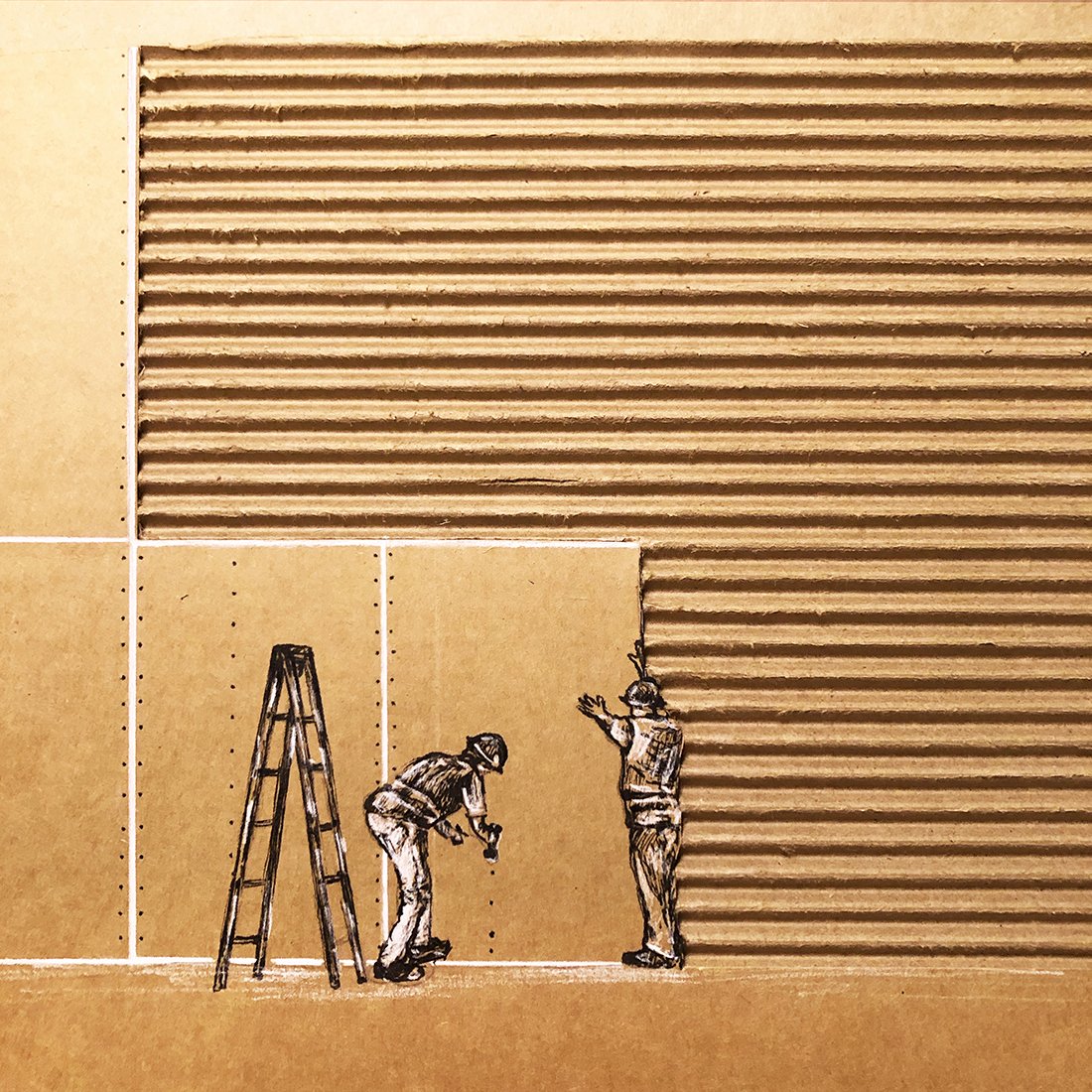
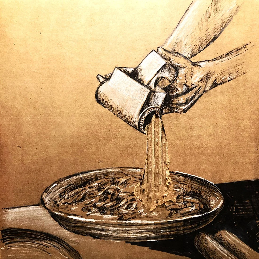
Visit my instagram to see all of them for the month https://www.instagram.com/jordanfretzart/
After creating cardboard art for the month each day (I may have missed one, we’ll get it back though), I did an exercise with some friends to tell me their top 10. This was wild to see how subjective art truly is. Some valued the idea more, some the execution/ just art of it and some just were downright confusing how they haven’t seen the Shaw Shank Redemption. All in all these types of exercises for me are really valuable to stretch creative muscles and continue to get better at both illustration and quick thinking. Well, til next Inktober, I’ll be pot-shotting ideas here and there as I get time.
MAULDIN HIGH FOOTBALL SPONSORSHIP MARKETING
We helped the Mauldin High School team with some marketing help. They can compete on the field, but not at all when it came to funding and improvements on the facilities. Our goal was to get local businesses excited about their potential and make an investment that improves the opportunities for the kids and makes them look more like champions. Working with my main man Carl Bradshaw, we got drone footage, shot on a RED to gain some practice footage, talked to coaches, made brochures, banners and visual mockups in order to sell the vision. I need more pics of the stuff, but you can see the videos and get the overall idea below.