• about
  • contact
  • blog
jordan fretz design | freelance graphic design & art direction | branding & logo design
  • about
  • contact
  • blog

BABIES ARE AWESOME

mmmm.jpg

Mercy Community Crisis Pregnancy Center is a great non-profit in Reading, PA. They help council and assist young mom's in need and show the love of Jesus to struggling families. Mom's in need can go to Mercy and get everything from baby wipes, to diapers, to some life advice. What an awesome ministry! Volunteers and donations really help make their ministry possible and like many ministries that have been around a long time, they needed a bit of a refresh with their brand, starting with their visual identity.

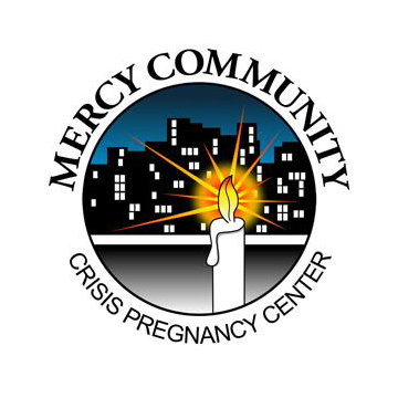
"Crisis Pregnancy Center", while being a descriptive part of the logo seemed to be a little wordy. Also, "Crisis" itself has a bit of a negative connotation to it and the simplicity of "Ministry" really seemed to get to the heart of what Mercy wanted to communicate. They exist to minister to the community and families in need. When a young mom comes needing help, yes, they can provide some support with the physical needs of baby products, but also encouragement and advice at a time when they really need it. 

Mercy also was taking over an additional space in another area of reading. The building was a real fixer-upper, but has come a long way with donated time and volunteers to be a great space for supporting couples new to parenting. With the addition of the new building, there was additional questions on how to brand the new building. Should that be connected to the Mercy Ministries logo or branded separately. The new building name was a combination of the location and a verse that fit the ministry. After multiple conversations and emails back and forth from PA, I started developing concept designs for the umbrella of Mercy Ministries and then also the 921 Center.

11.jpg
17.jpg
jordan-fretz-design-mercy-ministries-identity-materials-1.jpg

As you can see, the center logo design was chosen (originally it was in a slightly different color scheme). In addition to the logo design, I designed a donations brochure for the 921 Center that would be a part of a launch package of materials. I really liked "The Room to Grow Campaign" name the Mercy team came up with and I thought using the combination logo (includes the mercy center family icon) to kick off the 921 Center would help connect the new project to the Mercy Ministries brand. The combination logo will also be used on signage for the new building. Typically the independent logo will be used, but in the launch I would like to get some awareness built around that family icon.

Also below is a glimpse at the Brand Standards Guide I put together for the new identity. I can't explain how nice that is to have for a brand that most likely will involve many different vendors and designers assisting on projects. One problem with many ministries or small businesses in general is that people come and go and nobody remembers who worked on what, where the original files are, and somehow they only have a pixelated version of their logo embedded in a word doc. Besides providing organized vector and raster filetypes that include full color PMS versions, grayscale versions, one color versions and reversed versions, I provide a description of each filetype and best practices for using each. The brand guide clears up spacing, what can and can't be done with the logo in marketing materials, color profiles, complimentary typefaces and examples of marketing materials that showcase how the brand should look. Anyway, I hate hearing businesses get toasted by either hiring a designer that doesn't give them any information because it's really valuable for any company rebranding.

jordan-fretz-design-mercy-ministries-identity-materials-3.jpg
jordan-fretz-design-mercy-ministries-identity-materials-2.jpg
tags: ministry logo design, logo designer, non-profit logo design, ministry brochure design, logo brand guidelines, graphic design, ministry branding, jordan fretz design
categories: Graphic Design
Saturday 03.24.18
Posted by Jordan Fretz
 

DMDS UGLY SWEATER CHRISTMAS CARD

Whenever I get a chance to use 2d artwork, or some other medium in a project I get pretty pumped. Not only does it change-up the usual on my end, it can make the project stand out and have a bigger impact as well. 

A co-worker of mine (Mary Baugh, check her out on instagram @mbbaugh) has a few framed cross-stictched pieces hanging on her office wall and I was really impressed with the look. There is something about the texture and home-made quality of the type specifically that was very interesting. I liked how simplified everything gets and thought it would be a fun medium for a card of some sort.

DMDS (Daniel Mobile Dentistry Services) serves the elderly at retirement communities and nursing homes with much needed dental care. I had no idea how stressful appointments can be for some of the elderly. I just assumed most nursing homes had dentists or someone checking their teeth there. I didn't know many elderly don't get the proper dental care they need. Frankly, until I talked to Dr. Daniel, I didn't think elderly dental care was super important, and had no idea how serious a dental problem can be for an elderly person. Anyway, DMDS does some important, great work for the elderly and I thought an ugly sweater dental card would be a cool handout to their patients.

"Here's to a white Christmas" has a double meaning and would be a fun payoff for the inside. There it was, I liked the idea, but that typically doesn't mean much :). I mocked up the idea and got everyone on board for the project and off to the cross-stitching races Mary went. I created the layout in vector form for the front of the card and we tweaked a bit for simplicity. Mary got the pattern and once finished with the stitched piece, I was able to scan in the layout to the computer. I made a few small tweaks to the final scan in photoshop and after trips back and forth with the printer, the final product is below. I did frame up the actual cross-stitched piece as well and was excited to deliver that to the dental office with cards and envelopes ready to mail. 

ugly-sweater-cross-stitch-design-by-jordan-fretz-2.jpg
dentist-ugly-sweater-christmas-card-by-jordan-fretz.jpg
tags: christmas card design, christmas card, dentist design work, dentist christmas card, dentist christmas ideas, ugly sweater christmas card, ugly sweater holiday card, dentist holiday card, ugly sweater design, cross-stitch design, cross-stitch holiday card
categories: Graphic Design
Saturday 12.09.17
Posted by Jordan Fretz
 

THANKS LOGOLOUNGE

LogoLounge was one of the first books I bought (besides class books) in college. Great books for inspiration, motivation and jealousy :). I was excited last year to be in a Bill Gardner trends video on Lynda.com, but even more excited to have 2 logos featured in Book 10. I also have RVW and WorthLend to thank for the projects and being great to work with. 

FullSizeRender 73.jpg
FullSizeRender 62.jpg
FullSizeRender 72.jpg
logolounge-trends-video-jordan-fretz-design-feature-2.jpg
tags: logo design, custom logo design, logolounge winner, award winning logo design, identity design, jordan fretz design
categories: logo design, Graphic Design
Wednesday 07.19.17
Posted by Jordan Fretz
 

GRAPHIS LOGO & IDENTITY BOOK RECOGNITION

Truth be told, I didn't know anything about the Graphis till last year. I saw some designers posting about it and the work recognized was great. Some big agencies were in the annuals and I thought I would send in a freelance identity project I had just completed. Identity work that stands out on designer blogs and award shows often times requires expensive printing methods. Foil stamps, embossing, debossing, metallic inks, etc. This project was the direct opposite of that. See the full project here. 

Anyway, excited to make the cut for the Gold category and be included with some great work. The book being dedicated to Paul Rand is pretty cool. He is one of my design heroes and I love that Steve Jobs story about him. Big thanks to Rob Belknap for taking a couple pics for me at his studio and to Chad Rucker for coming to shoot some ammo into stationary.

tags: graphis, graphic design recognition, identity design
categories: Graphic Design, branding, identity design
Thursday 06.22.17
Posted by Jordan Fretz
 

MAY THE FOURTH

tags: yoda painting, star wars typography, yoda illustration, yoda watercolor, may the 4th, may the fourth, star wars illustration
categories: Graphic Design, Artwork
Tuesday 06.13.17
Posted by Jordan Fretz
 

copyright jordan fretz design