• about
  • contact
  • blog
jordan fretz design | freelance graphic design & art direction | branding & logo design
  • about
  • contact
  • blog

PRINT MAGAZINE TWEET

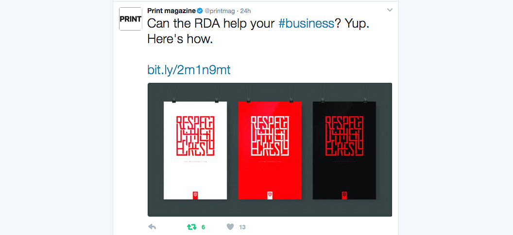
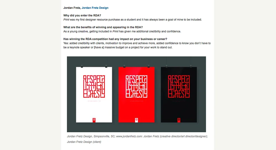
Pretty cool to be included in promotion for the 2017 Print Design Annual competition. Look, my answers were written quickly in response to an email and won't be winning any awards, but it's just fun to have work associated with such a professional publication.

jordan-fretz-design-print-regional-final.jpg
print magazine design annual competition
Saturday 03.04.17
Posted by Jordan Fretz
 

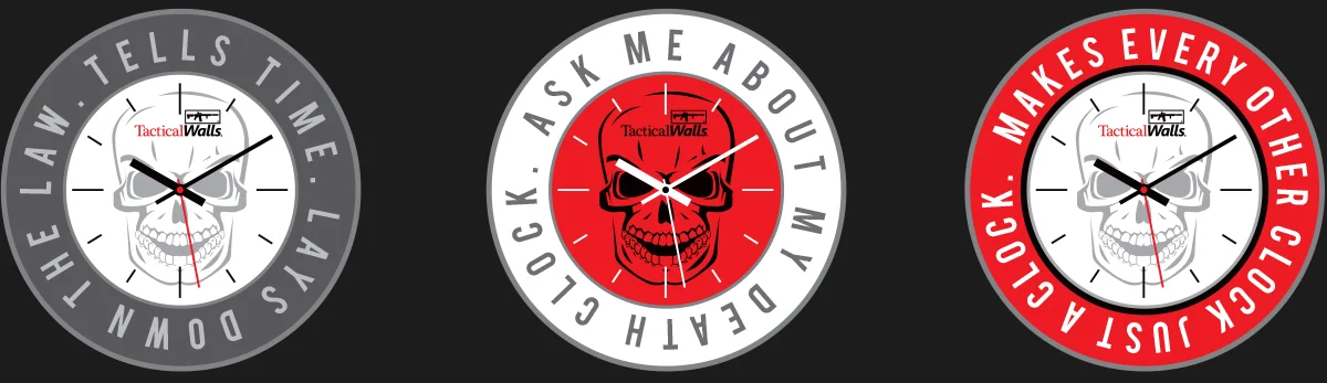
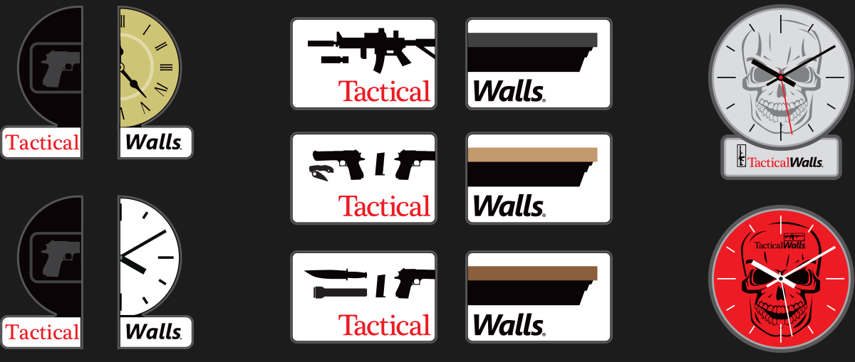
MORE IDEAS FOR TACTICAL WALLS

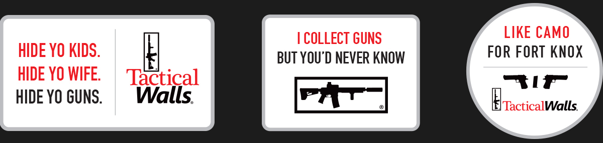
Some swag designs that may or may not be used. The first layout was a social media idea that spoke to how well Tactical Walls' products hide valuables and firearms. The other layouts were patch and sticker layouts that speak to multiple benefits. The half-patch idea speaks to the customization and options you can have in products. The idea was to create multiple versions for each product where those could choose any two sides and line them up to form the final product.

tags: swag design, gun industry swag, gun industry social media design, gun industry social post
Friday 01.27.17
Posted by Jordan Fretz
 

A HEART FOR POE MILL

The area surrounding Griggs Church is known as Poe Mill. Griggs was originally named after a local business owner who impacted the community greatly and was always willing to help those in need. Today, the church is not only being revitalized itself, but is revitalizing the surrounding area. Pastor Mitch and the people of Griggs are doing great things for the less fortunate in the community and keeping the original theme of the church going. The goal of this type treatment was to communicate to the surrounding community our love for the area of Poe Mill. The text really speaks to the core message of the church and I think the heart negative space in the "M" shape help reinforce that theme. The type treatment will be used on staff t-shirts, posters and cards letting people know they are prayed for.

church-community-logo-design-for-poe-mill-greenville-sc.jpg
tags: charity logo, church message logo
Wednesday 01.25.17
Posted by Jordan Fretz
 

SOME AFTERNOON TYPOGRAPHY

Going to do a series of hand-drawn typography in this style with scripture references. Really is fun to design and I am considering creating a full alphabet. Maybe just lowercase letters to start. Or maybe uppercase. Or maybe both. Anyway, more to be added here someday.

forgiven hand-drawn typography design
tags: custom typography, christian typography, drawn type, hand drawn type
Saturday 01.21.17
Posted by Jordan Fretz
 

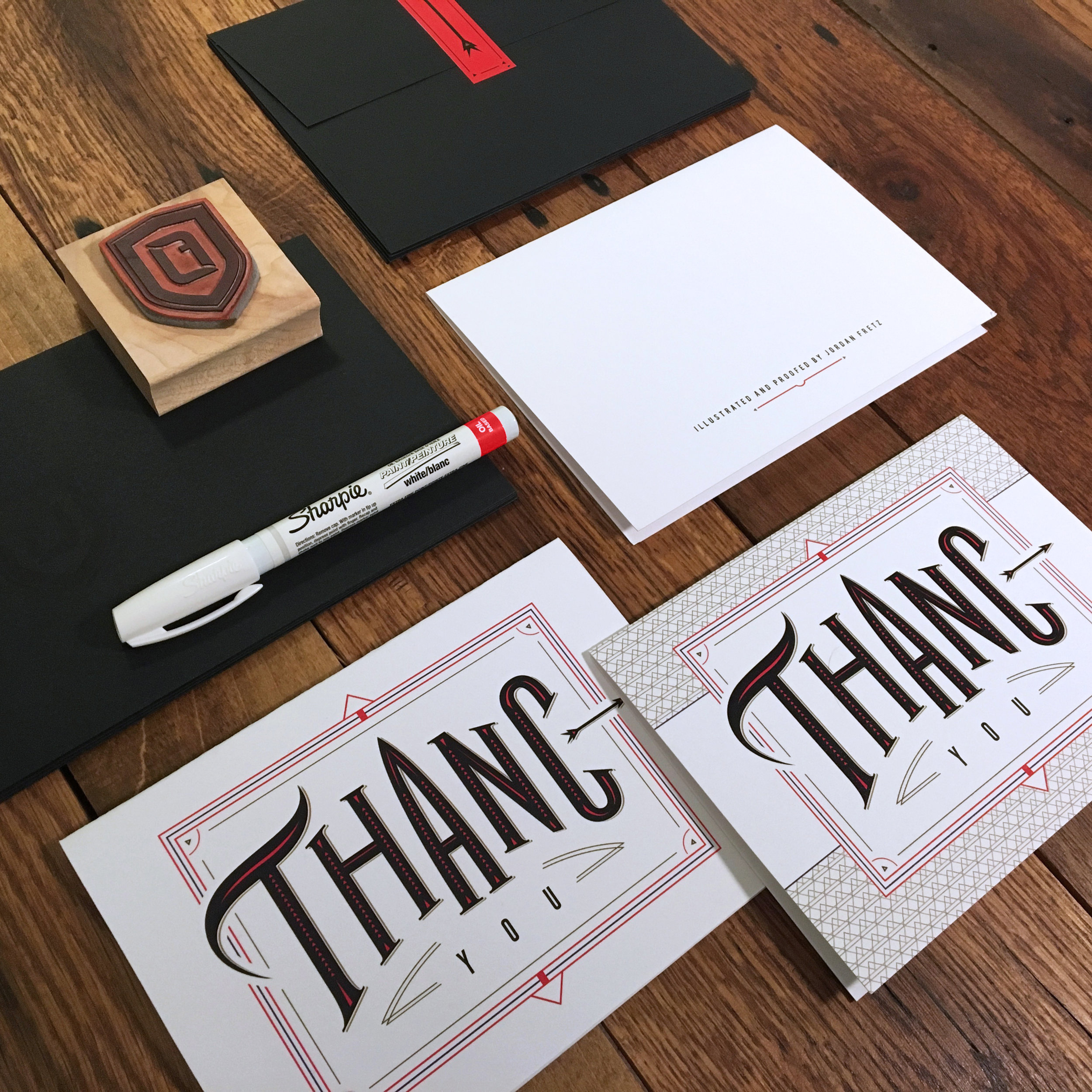
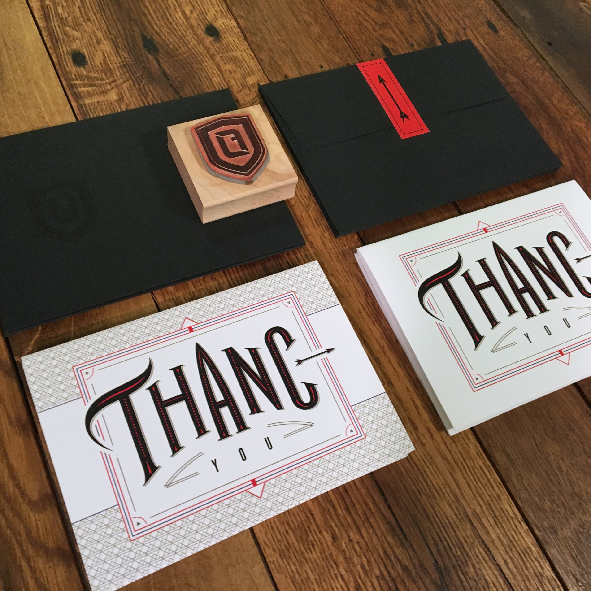
ENVELOPES, STICKERS, ETC. ARE IN

The final pieces of my thank you's have finally arrived. See more about them in my earlier post here: thank you blog post. 
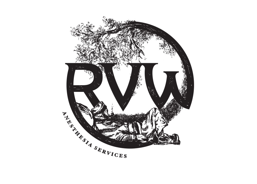
tags: thank you cards, thank you card design, hand drawn type, drawn type
Saturday 01.21.17
Posted by Jordan Fretz
 

RVW IDENTITY

What does RVW stand for? Rip Van Winkle of course! Illustration and logo design done for a consultants group specializing in sleep. This mark was really fun to illustrate and develop.

Anyway, props to the client on trusting me to illustrate a detailed logo without needing to see multiple flushed out versions. The drawn type with subtle texture adds to the hand-drawn look and fits the overall theme.

RVW illustrated logo designed by jordan fretz
RVW illustrated logo design and identity by jordan fretz
RVW illustration logo design
tags: illustrated logo, hand drawn logo, anesthesia logo design, anesthesia consultants, rip van winkle
Monday 01.09.17
Posted by Jordan Fretz
 

FRAMED UP MORE CANVAS GICLEES

tags: Gicle'es, canvas Gicle'es, pen and ink paintings, ink wash paintings
Monday 01.02.17
Posted by Jordan Fretz
 
Newer / Older

copyright jordan fretz design