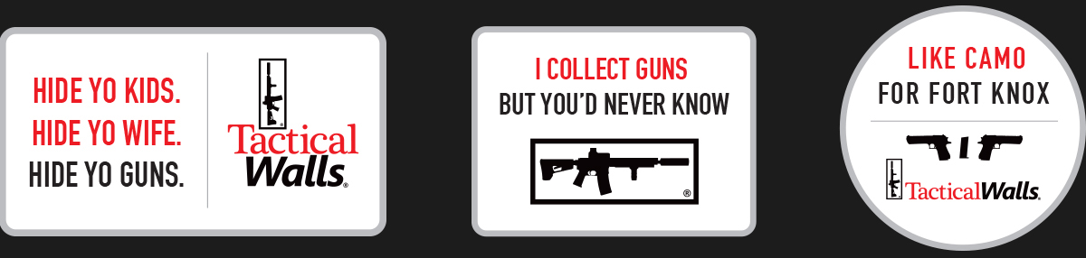
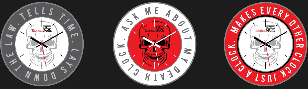
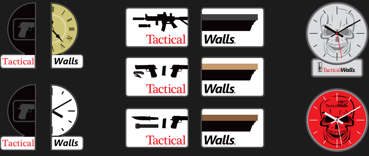
Some swag designs that may or may not be used. The first layout was a social media idea that spoke to how well Tactical Walls' products hide valuables and firearms. The other layouts were patch and sticker layouts that speak to multiple benefits. The half-patch idea speaks to the customization and options you can have in products. The idea was to create multiple versions for each product where those could choose any two sides and line them up to form the final product.

SOME AFTERNOON TYPOGRAPHY
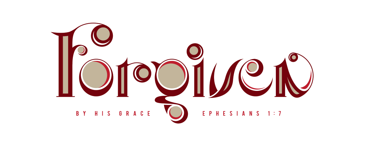
Going to do a series of hand-drawn typography in this style with scripture references. Really is fun to design and I am considering creating a full alphabet. Maybe just lowercase letters to start. Or maybe uppercase. Or maybe both. Anyway, more to be added here someday.
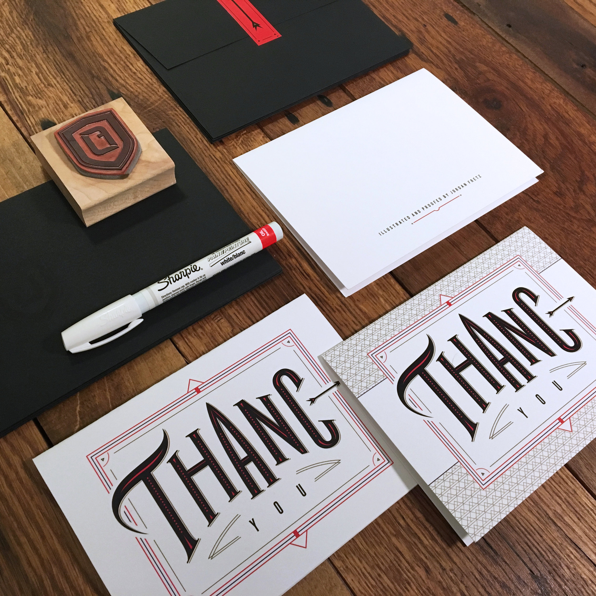
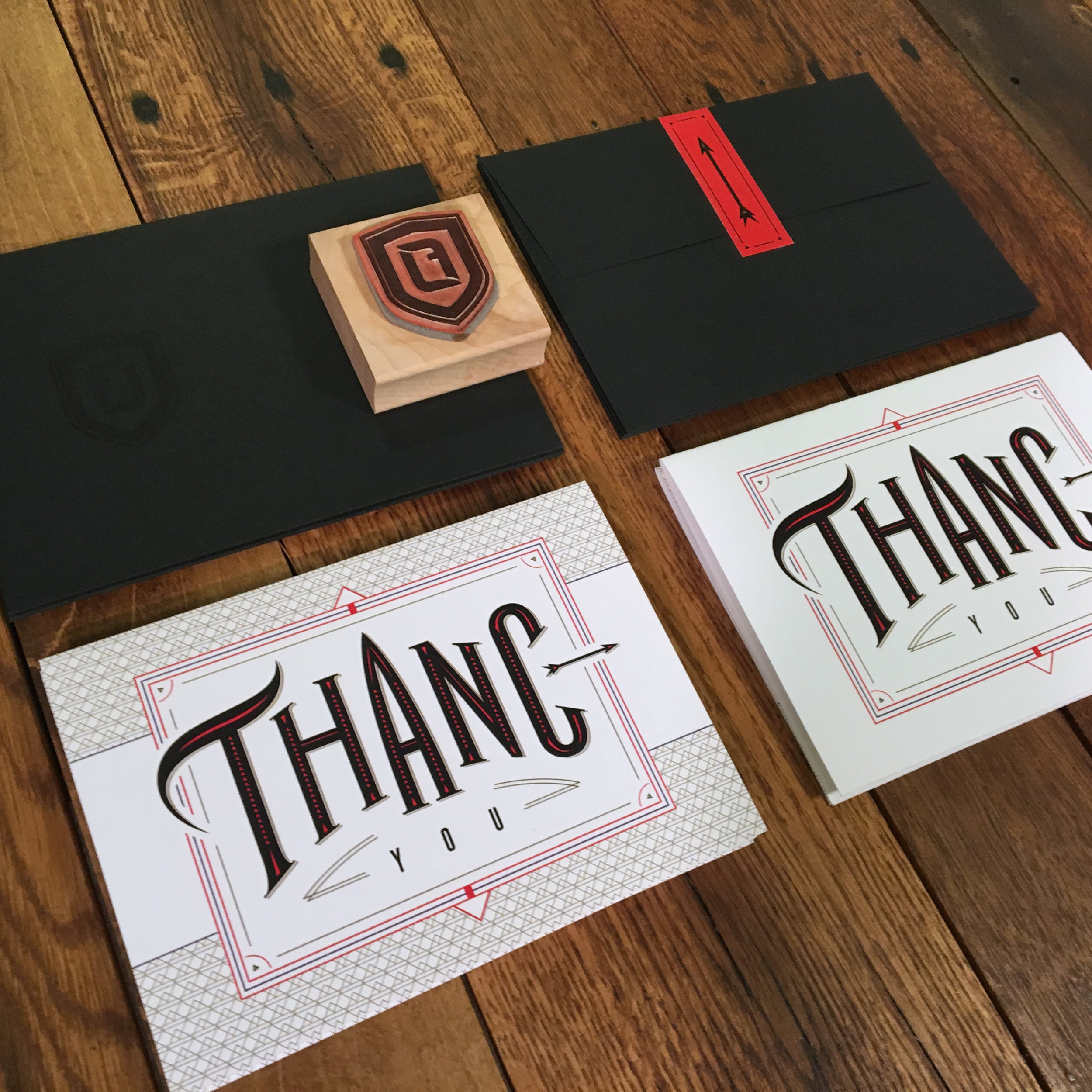
ENVELOPES, STICKERS, ETC. ARE IN
The final pieces of my thank you's have finally arrived. See more about them in my earlier post here: thank you blog post.


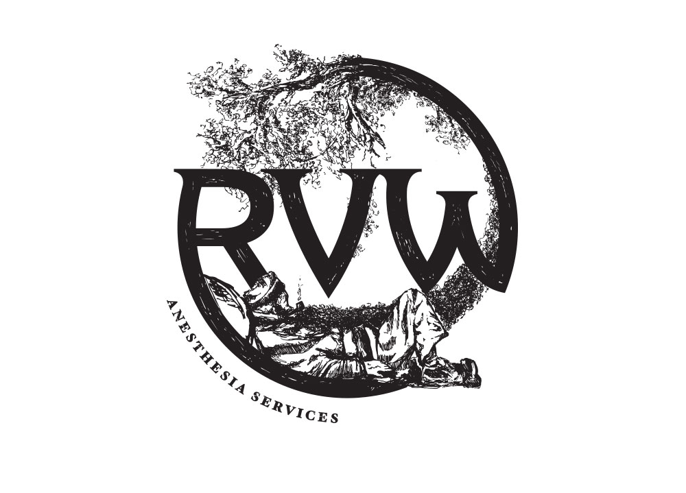
RVW IDENTITY
What does RVW stand for? Rip Van Winkle of course! Illustration and logo design done for a consultants group specializing in sleep. This mark was really fun to illustrate and develop.
Anyway, props to the client on trusting me to illustrate a detailed logo without needing to see multiple flushed out versions. The drawn type with subtle texture adds to the hand-drawn look and fits the overall theme.


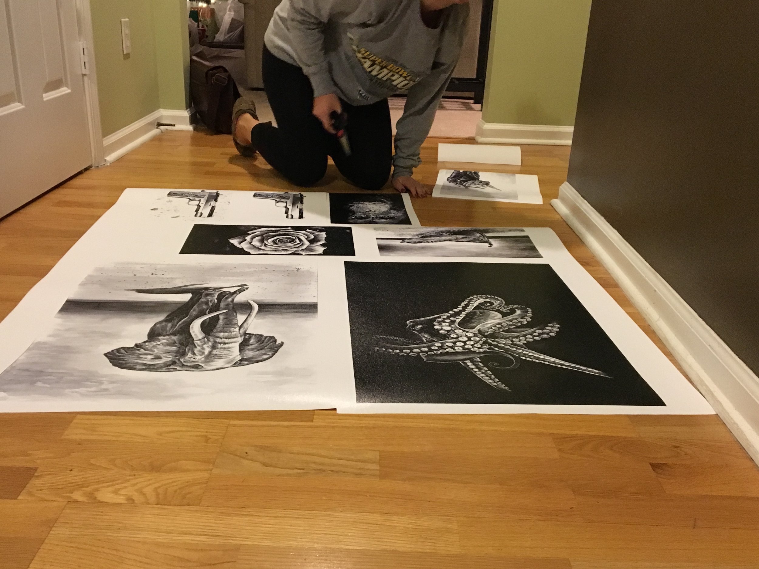
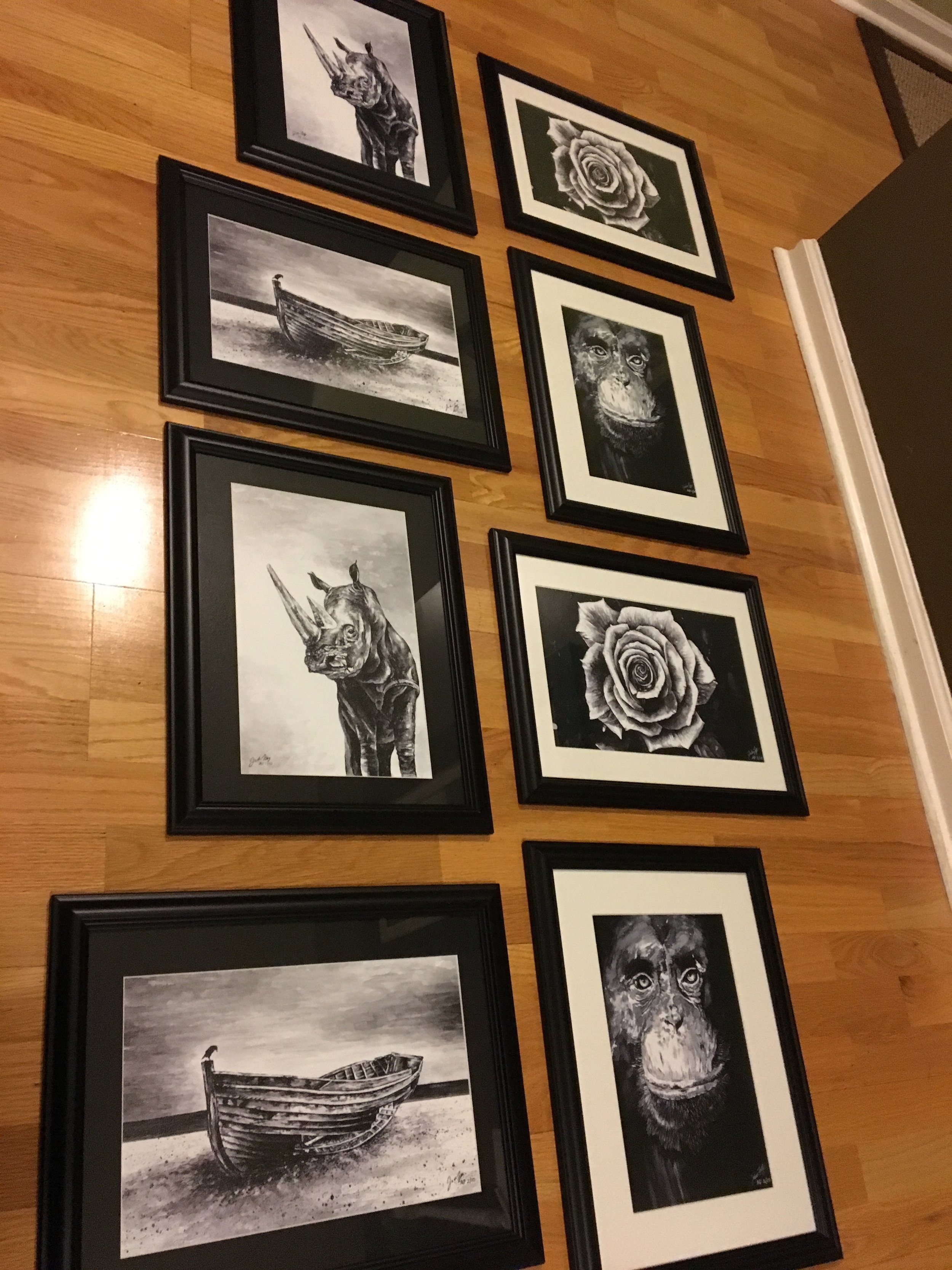
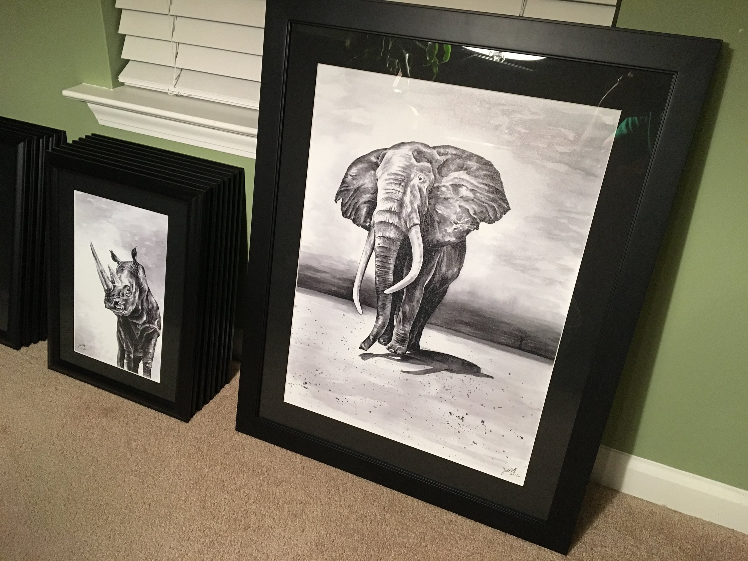
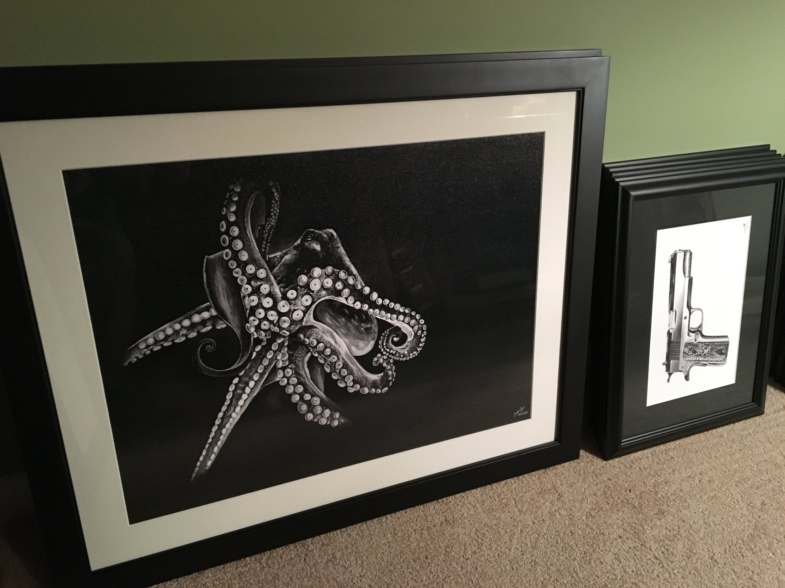
FRAMED UP MORE CANVAS GICLEES


QUICK HOLIDAY TYPOGRAPHY
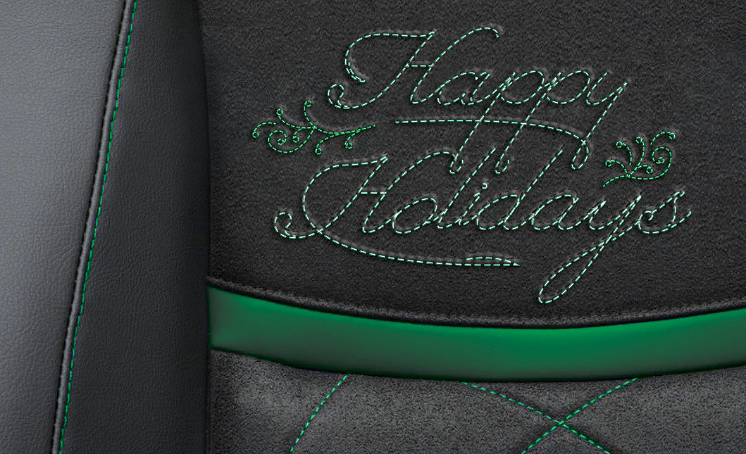
Last minute type treatment done for a car interior fabric client. This was used in their holiday mailings and utilized a thumbnail photo of their seat design with the multiple fabric styles and textures working together, but did it in a subtle way without pushing that capabilities message over the simple message of Happy Holidays. We can sell the capabilities and key messages the other 350-some days of the year. Anyway, for a rush design, I think it worked pretty well overall and we made the client happy too.