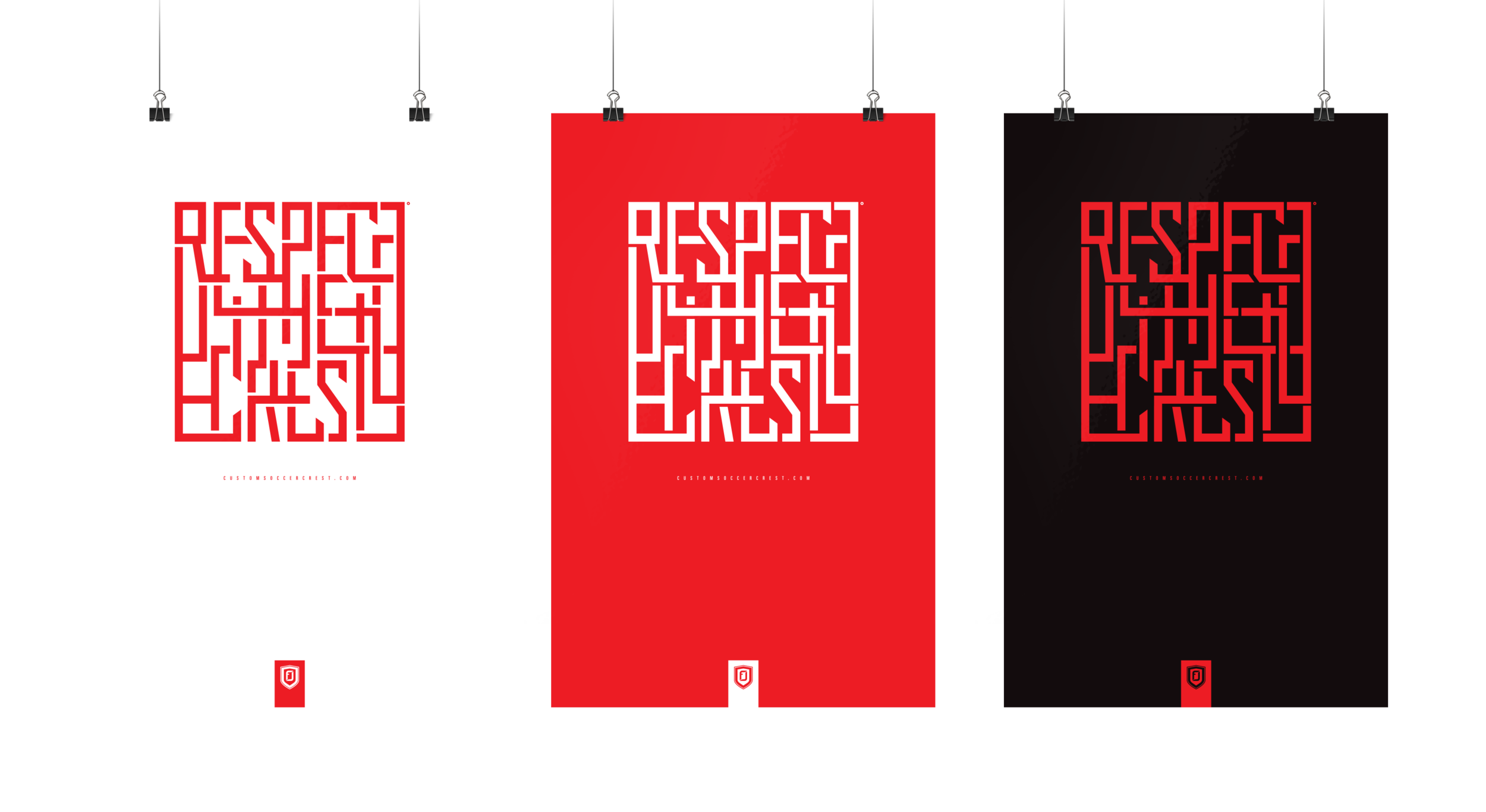
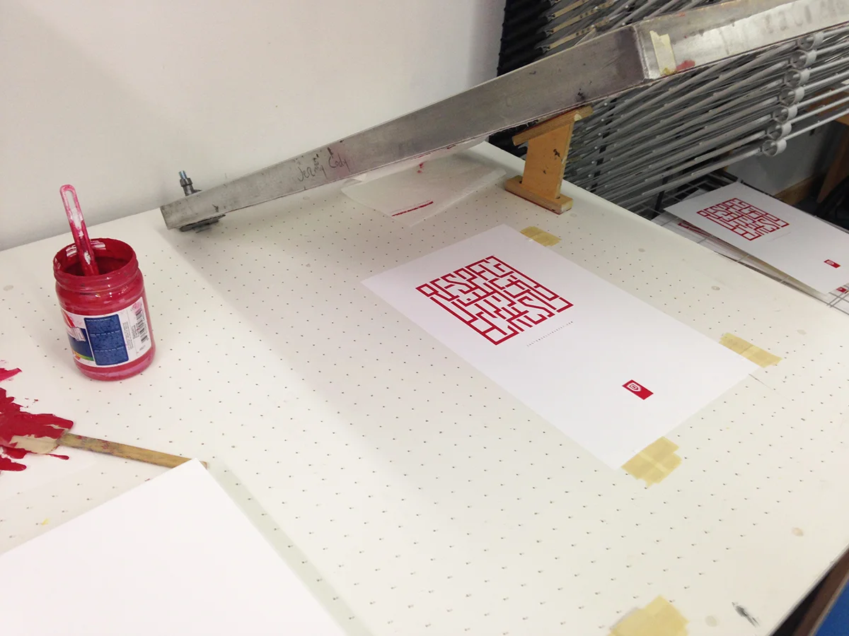
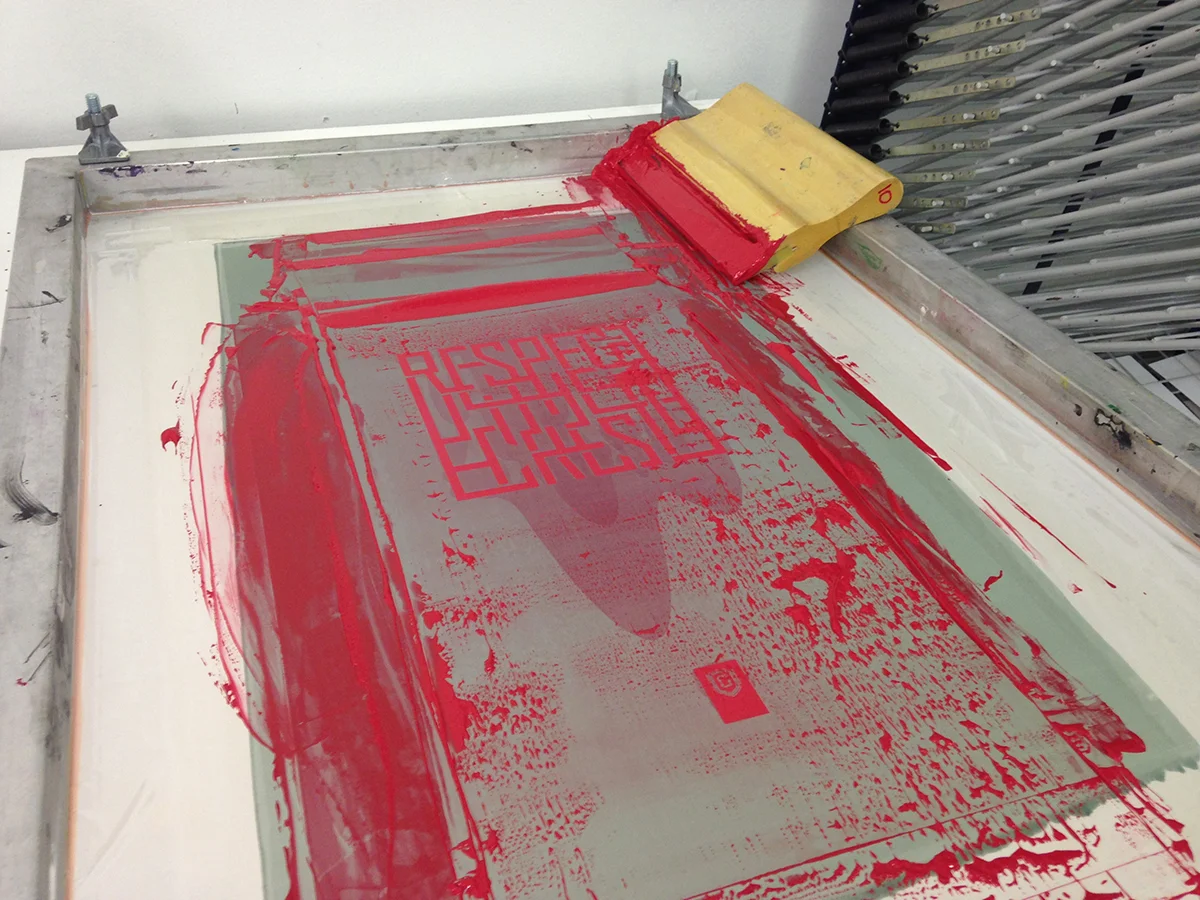
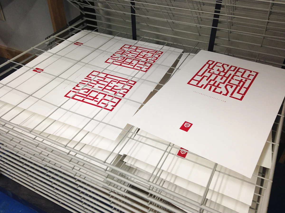
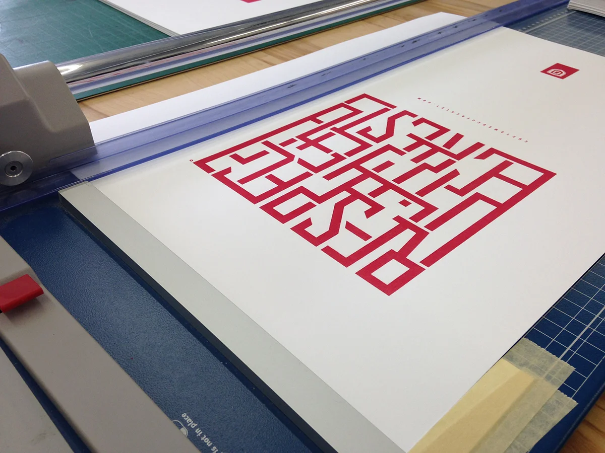
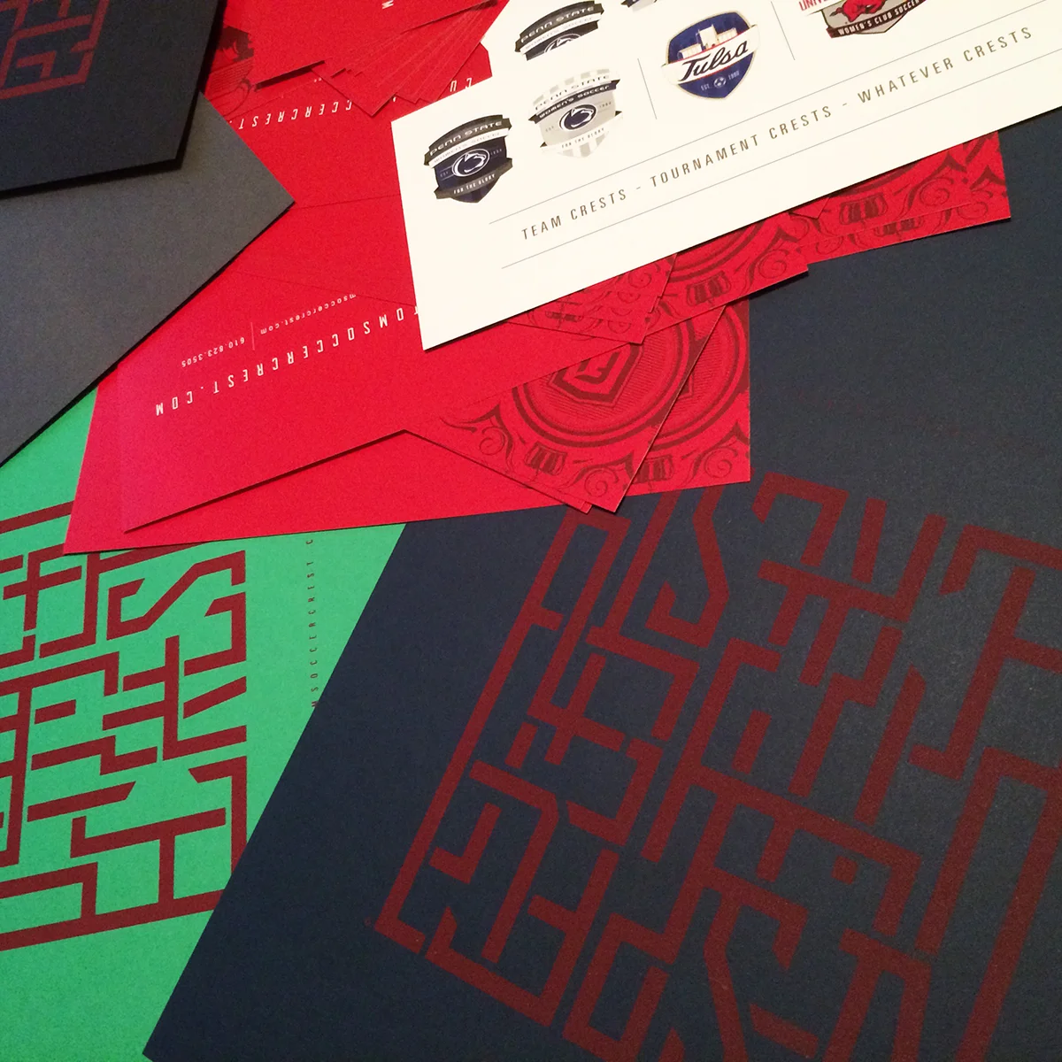
"Respect the Crest" was a phrase I used in promoting my soccer identity work (customsportslogo). I developed screen-printed posters and they were sent out to more D1 universities, semi-pro and pro organizations. This work made it into Print Magazine and was featured in a Logolounge trend video as well.
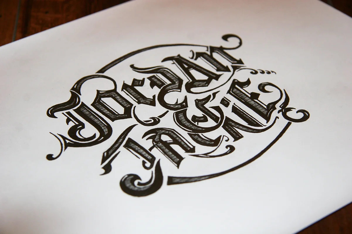
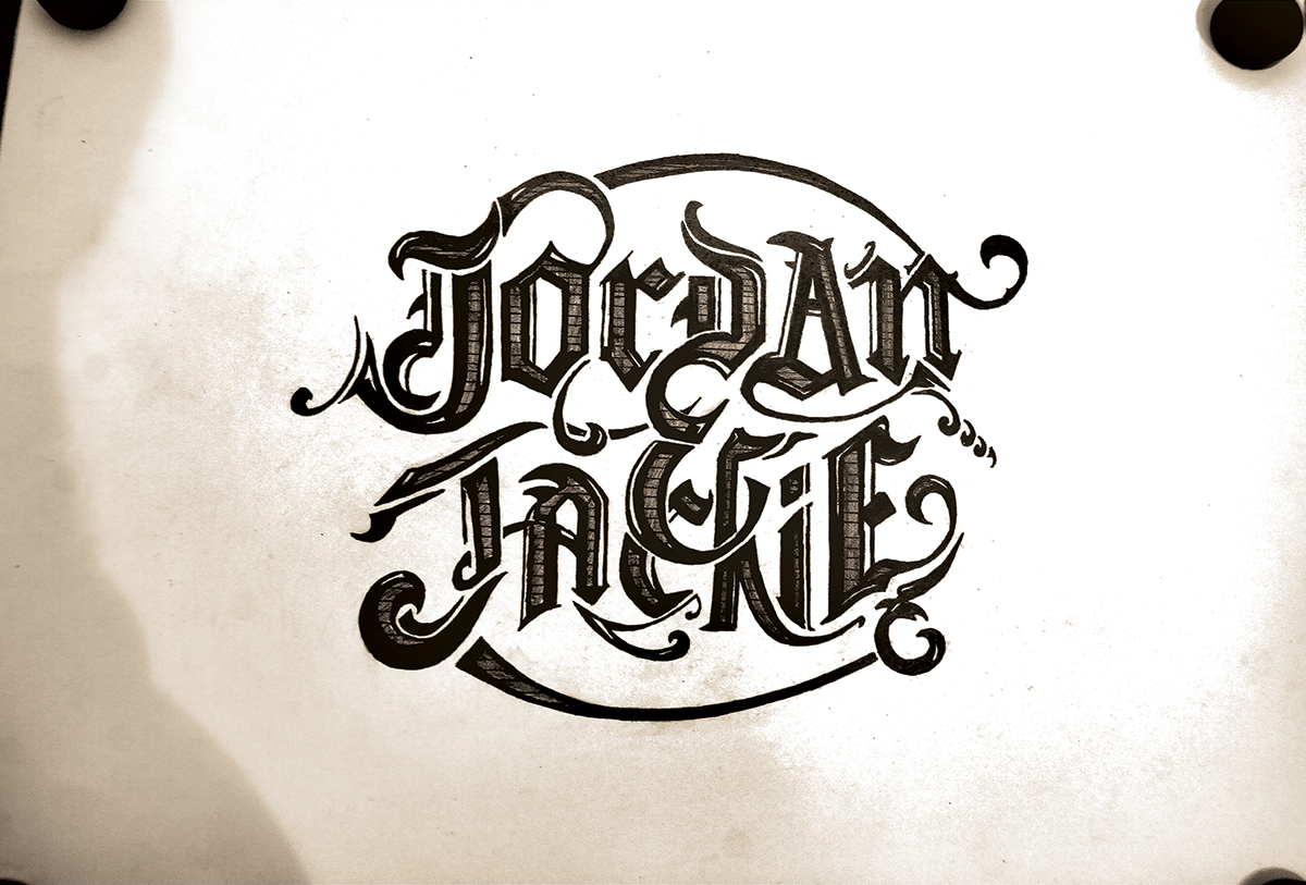
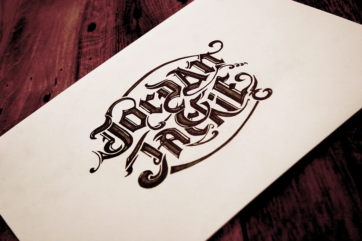
It's not often I have tons of time during the day to sketch out some typography. If I was going to carve out some time and do away with sleep for a project, my wedding was the perfect venue. For our wedding invites, save-the-dates and favors, I wanted to do something custom to us and our story. So I used subtle elements and imagery that pertained to our relationship and incorporated those into the typography.
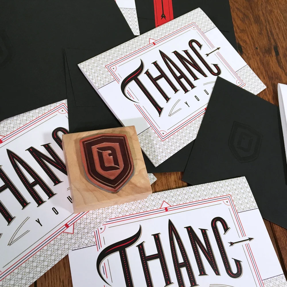
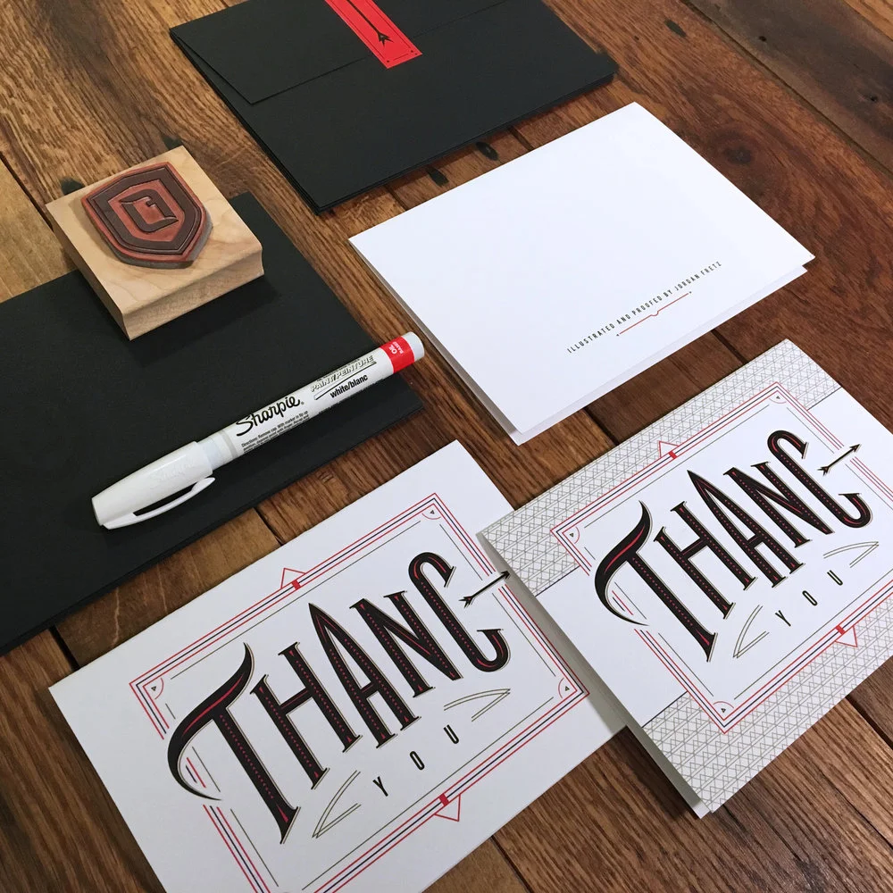
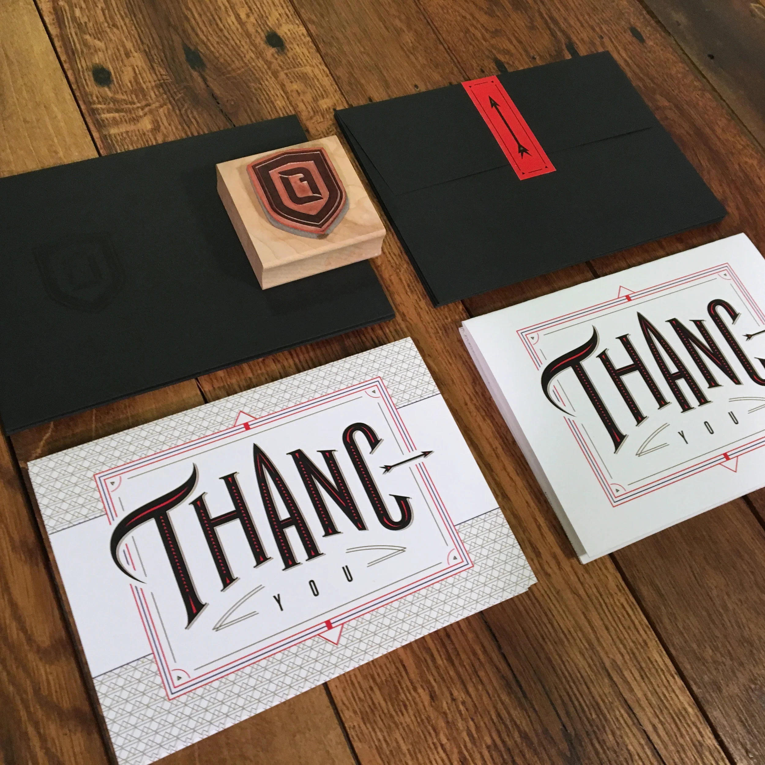
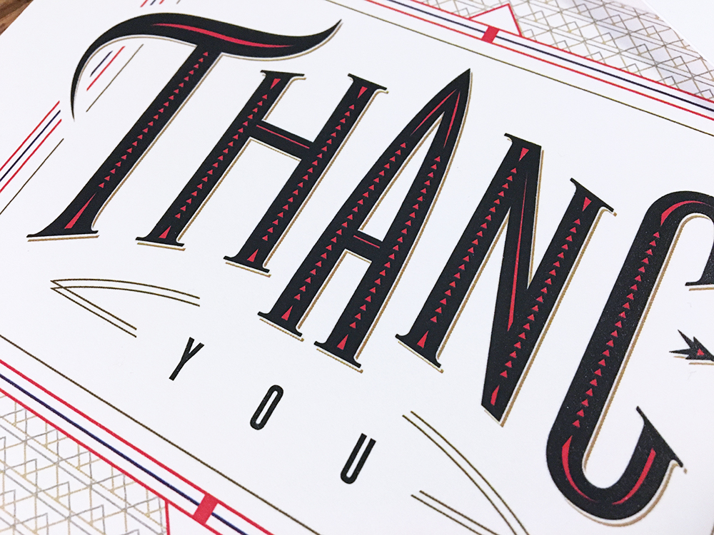
I'm not sure I know of a worse speller than myself. In the third grade I was the first one out of the spelling bee and will never forget the shame of walking back to my seat first! Anyway, I have moved on but still am pretty terrible. It's pretty well known at the agency too that my stuff should probably be proofed twice before going to clients. I poke fun at myself in my personal "thanc you" cards by having the misspelling and the back reads "Illustrated and proofed by Jordan Fretz." I liked the idea of drawing type and having an ornate card design with a misspelling included. Was fun to create and one of the more on-brand designs I've done recently :).