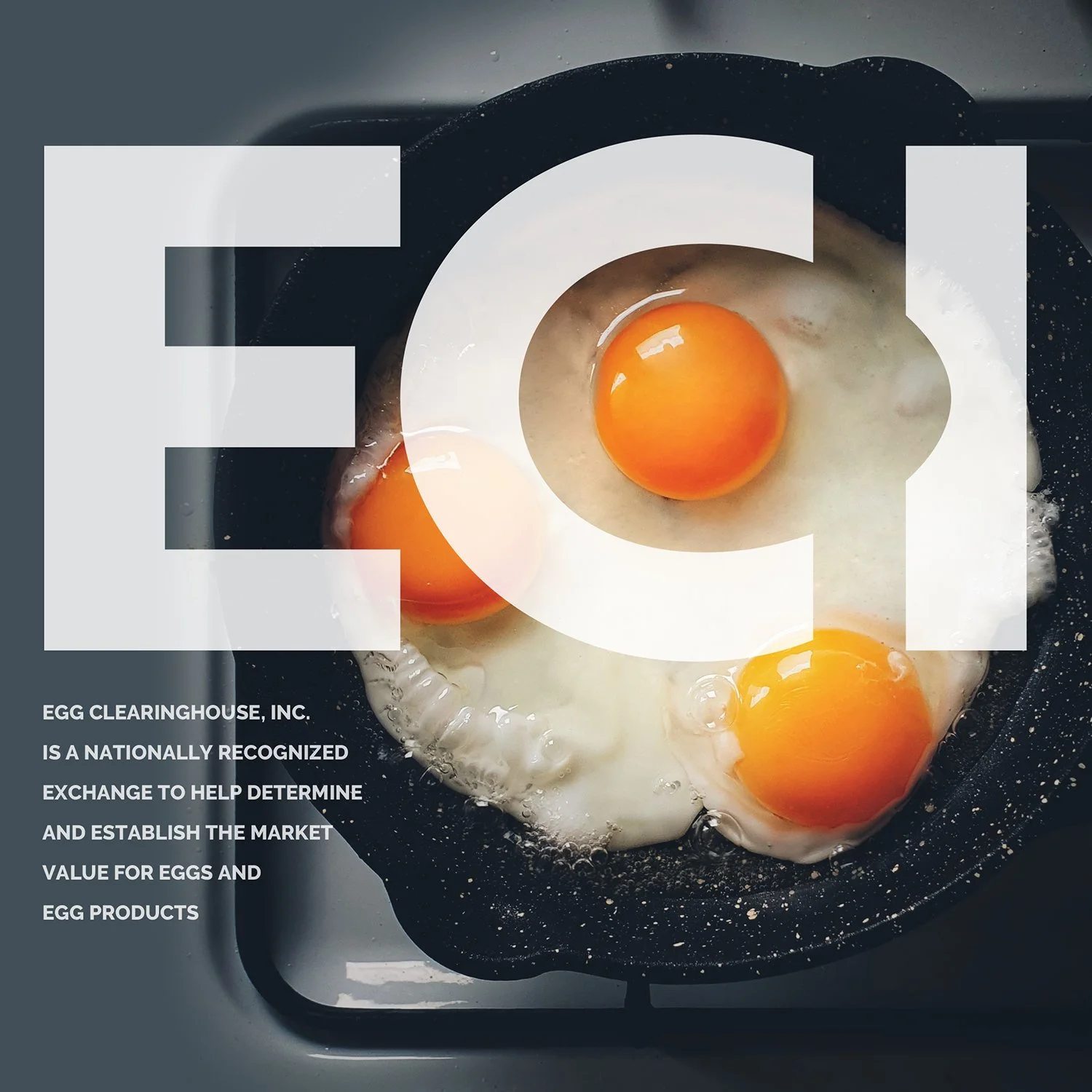
Simple. It’s the goal of every logo I design. Simple stands the test of time. Simple stands out amongst the chaos. Simple is remembered.
ECI was a great opportunity to keep things simple. The subject matter of eggs was a blessing and a curse. In one sense, having one thing you’re associated with is awesome, but on the other hand there is a lot out there. Avoiding what’s been done already in both their market and readily visible online, not easy. Seeing something similar, especially in this case, really could become confusing to prospect members/customers.
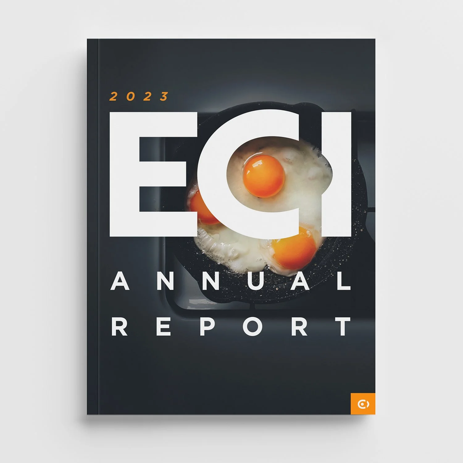
Being known as ECI already and recognized in their market, the description text really wasn’t needed in this case. Simpler! Winning! The final logo was responsive in the sense that if there is a purpose or need for the full name to be included, it could be in both horizontal or vertical applications, even in a badge.
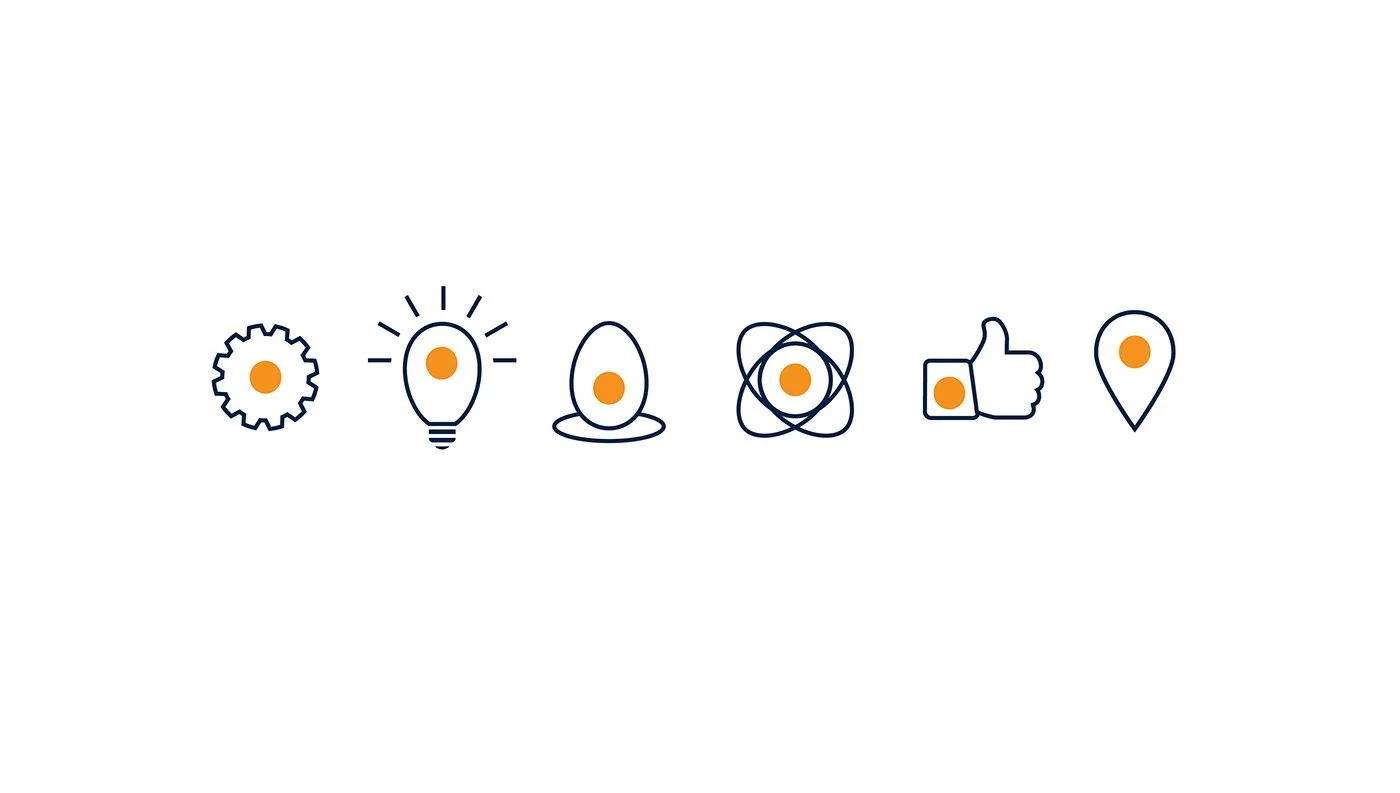
In creating brand identity, the illustrations and icons, brand patterns, etc. all could include the orange dot (yolk). Since the previous logo was limiting in application/use, I wanted this rebrand to include a logo that was more versatile and flexible with brand elements as well.
All in all, this really was a rewarding project and the leadership was really pleased with the versatility of such a simple word mark vs. the large swoosh element creating such small, harder for application secondary text of the previous logo. Something to remind myself of again on the next project: SIMPLE WINS. Keep it simple stupid.