
I never knew how a Whiskey Ball was actually made until I saw IceCraft’s product. They manufacture a product that takes a block of ice, could be from water frozen in a solo cup or anything large enough, and compresses it as the ice melts into a perfect ball. It takes a matter of seconds for the weight of the top to drift down forming the ball. Pretty cool! Anyway, before they sell and promote the them for people to keep on their wet bar shelves, they needed a logo design and that’s what I do. They wanted an older ornate look and it was a lot of fun to create a few flourishes and do some custom type. Below are the layouts and finally the chosen version.
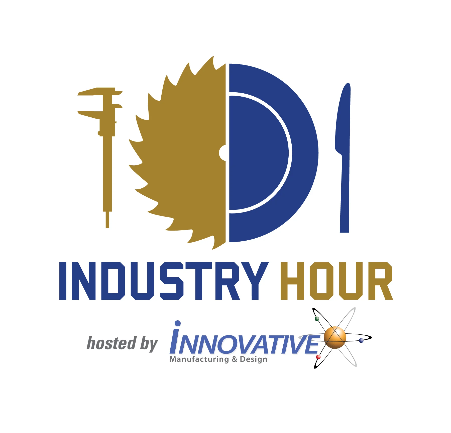
MANUFACTURING AND BBQ TOGETHER AT LAST
Basically combine manufacturing and dinner each quarter for a meeting of the minds and that sums up Industry Hour. It’s a great way for Innovative Manufacturing to look like a thought leader and make some great connections. The meetings have been growing since they started this a while back and even have sponsors now for the event. Putting a brand look to the meetings was a lot of fun and you can see how my thoughts ranged from blades to gears and the balance I kept tweaking between dinnerware and tools.


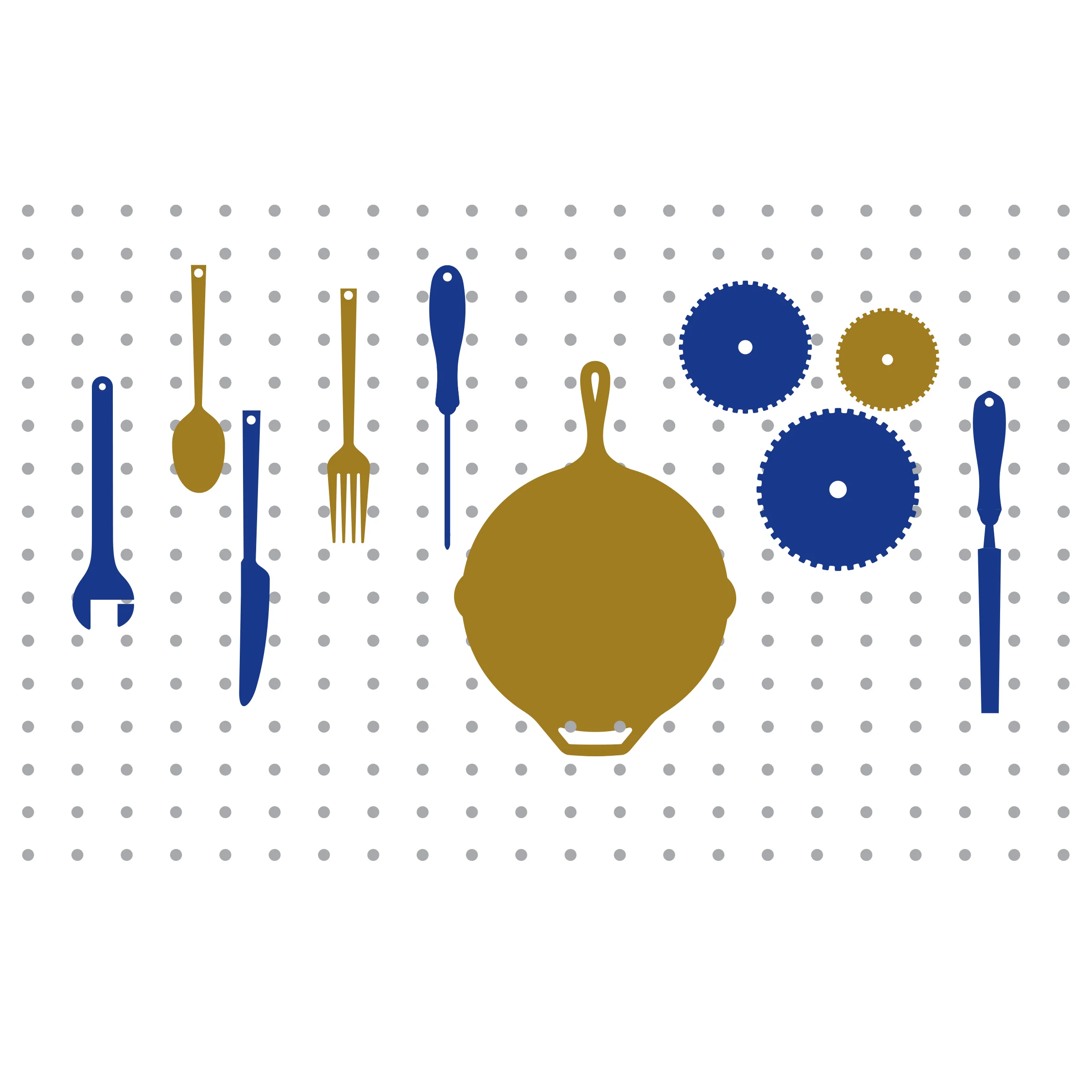
In the end, the caliper was the tool common to many of the businesses that would be present and just made sense for the meeting. It’s not often I get logos where I’m given two distinct things to combine (like everyone on dribble makes up, Monkey Music or something) and that made this one a lot of fun.

WHAT'S A VISUAL CASE STUDY?
Case studies are pretty common to portfolios. They tell the original problem (sometimes talking over the brief), what happened over the course of the project and how the solution was arrived at. They show some work and maybe even talk over what goals were met or exceeded with some statistics (number of impressions, number of leads etc.).
My soccer and sports logos have been a good side hustle for me. I have teams, clubs and organizations contacting me for work after seeing some designs on google images, pinterest, dribble or hopefully after visiting customsportslogo.com or customsoccercrest.com. The easiest way to sell work for new projects is client seeing previous projects and admiring the thought, styles and professionalism. For some reason when I seek out work, it's more difficult to gain that level of trust and be given the time with the same level of engagement.
With this in mind I wanted to create some visuals that would put some of my designs in an environment that relates to the design itself. I thought showing some of the iterations or variations on design would give insight to the time spent on each project and the level of detail I work with. I didn't want to include all the copy points and info surrounding the project, as I feel most people glance over that anyway, but instead show compelling visuals and keep them simple. Here are the first few I have done and I am excited to do quite a few and tell the stories visually online.

TRIUNE CHARITY AUCTION

I had a great time at the Triune Art Auction at Noma Square in Greenville. All sales went to the Triune Mercy Center and the work they are doing for the homeless. The event had a silent auction as well as a live auction with over 50 pieces of artwork. Its was exciting to see the charcoal panda among the top few sellers. Not bad for a salvaged piece of cardboard :).


DIVERSE BY DESIGN
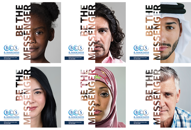
Some recent handout materials for a consulting group specializing in social justice and equity. Much of their philosophy is centered around reflection and self awareness. The goal was to create an interesting leave behind and various other collateral pieces that would continue to reinforce their key themes and push viewers to give some feedback/take a deeper dive online.
For the handout specifically, a few shown below, we were able to print various fronts consisting of different age ranges, ethnicities and appearances. This fit well with the overall message and really added some interest in seeing what individuals took which handout and how many were left of each race/age. Just a cool talking point someday maybe if there are 50 copies of one group and only 2 left of another. Anyway, it was a fun project in concepting and designing the handouts and also creating some posters that reinforced a similar message and style.

WOULD HAVE BEEN THE BEST BARTER EVER
I love to barter, but this one didn't have a chance :). I may never have a custom home, but I'd like to design for more custom home builders. Fairview wanted a mark that would convey a home and feel more modern than their previous design (before a name change). Currently their brand mark was a multi-colored home and didn't have that high-end/professional look that they were looking for.
Rarely have I done real client projects that seem to combine two really interesting names, like "Monkey Cafe" which I just googled and yes there is a "Monkey House Cafe" in existence. Those interesting names can really spark creative designs. The challenge with a logo like this is creating a mark that is interesting and can be the essence of a home, but not be super literal and dull.
After a bunch of sketches and after exploring a few different directions, we liked how an "F", when tipped over appears to make two peaks of a roof. It's a very simple solution and could be used in some interesting ways in identity and future branding. The next step was finding the right balance of "F" to roof lines and the correct weight for the logo.

Multiple type styles were also explored and while the Sans Serif type gave a very modern look, Fairview had previously incorporated a script into their design and a serif type style seemed to be a smooth transition. I altered the type slightly with some added kerning and extended the leg of the "R" as it transitions down to "custom homes". In the final execution, I also changed from the original black and gold color scheme I showed to a navy blue and gold. It was a little less harsh and I liked how established the final layout looks.
BABIES ARE AWESOME
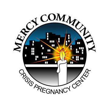
Mercy Community Crisis Pregnancy Center is a great non-profit in Reading, PA. They help council and assist young mom's in need and show the love of Jesus to struggling families. Mom's in need can go to Mercy and get everything from baby wipes, to diapers, to some life advice. What an awesome ministry! Volunteers and donations really help make their ministry possible and like many ministries that have been around a long time, they needed a bit of a refresh with their brand, starting with their visual identity.
"Crisis Pregnancy Center", while being a descriptive part of the logo seemed to be a little wordy. Also, "Crisis" itself has a bit of a negative connotation to it and the simplicity of "Ministry" really seemed to get to the heart of what Mercy wanted to communicate. They exist to minister to the community and families in need. When a young mom comes needing help, yes, they can provide some support with the physical needs of baby products, but also encouragement and advice at a time when they really need it.
Mercy also was taking over an additional space in another area of reading. The building was a real fixer-upper, but has come a long way with donated time and volunteers to be a great space for supporting couples new to parenting. With the addition of the new building, there was additional questions on how to brand the new building. Should that be connected to the Mercy Ministries logo or branded separately. The new building name was a combination of the location and a verse that fit the ministry. After multiple conversations and emails back and forth from PA, I started developing concept designs for the umbrella of Mercy Ministries and then also the 921 Center.


As you can see, the center logo design was chosen (originally it was in a slightly different color scheme). In addition to the logo design, I designed a donations brochure for the 921 Center that would be a part of a launch package of materials. I really liked "The Room to Grow Campaign" name the Mercy team came up with and I thought using the combination logo (includes the mercy center family icon) to kick off the 921 Center would help connect the new project to the Mercy Ministries brand. The combination logo will also be used on signage for the new building. Typically the independent logo will be used, but in the launch I would like to get some awareness built around that family icon.
Also below is a glimpse at the Brand Standards Guide I put together for the new identity. I can't explain how nice that is to have for a brand that most likely will involve many different vendors and designers assisting on projects. One problem with many ministries or small businesses in general is that people come and go and nobody remembers who worked on what, where the original files are, and somehow they only have a pixelated version of their logo embedded in a word doc. Besides providing organized vector and raster filetypes that include full color PMS versions, grayscale versions, one color versions and reversed versions, I provide a description of each filetype and best practices for using each. The brand guide clears up spacing, what can and can't be done with the logo in marketing materials, color profiles, complimentary typefaces and examples of marketing materials that showcase how the brand should look. Anyway, I hate hearing businesses get toasted by either hiring a designer that doesn't give them any information because it's really valuable for any company rebranding.

